| Image |
Comment |
| 06/26/2007 10:34:05 PM |
|
 Photographer found comment helpful. Photographer found comment helpful. |
| 06/26/2007 07:06:15 PM |
Jump!by faeryComment by posthumous: good negative space. I like how she's looking out of frame. that redeems the composition. |
| Photographer found comment helpful. |
| 06/26/2007 06:07:17 PM |
|
| Photographer found comment helpful. |
| 06/26/2007 03:25:45 PM |
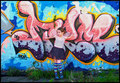
Rock Angelby faeryComment by karmat: Her colors match the wall nicely. The centered composition doesn't work as well though. Maybe move her, or the overall composition, more to the left or right. |
| Photographer found comment helpful. |
| 06/26/2007 01:11:42 PM |
|
| Photographer found comment helpful. |
| 06/26/2007 10:51:29 AM |
Jump!by faeryComment by kawhona: needed a bit quicker shutter time to sharpen it up it looks like or possibly a flash would have done it. |
| Photographer found comment helpful. |
| 06/26/2007 12:11:55 AM |
Rock Angelby faeryComment by VitaminB: I think its really cool that you lined up the colours in the grafitti with the colour on her clothes. Very well executed. 9 |
| Photographer found comment helpful. |
| 06/25/2007 08:12:21 PM |
|
| Photographer found comment helpful. |
| 06/25/2007 07:38:13 PM |
|
| Photographer found comment helpful. |
| 06/25/2007 04:44:59 PM |
|
| Photographer found comment helpful. |
Home -
Challenges -
Community -
League -
Photos -
Cameras -
Lenses -
Learn -
Help -
Terms of Use -
Privacy -
Top ^
DPChallenge, and website content and design, Copyright © 2001-2026 Challenging Technologies, LLC.
All digital photo copyrights belong to the photographers and may not be used without permission.
Current Server Time: 06/22/2026 09:11:08 PM EDT.