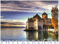
Greetings from Switzerland !by
Noel_ZHComment by Artifacts: This image will be a top scorer in this challenge. It is an excellent composition.
The strength of the composition, no surprise, is the lighting on the castle and its reflection. The way you have worked it is superb. The lighting of the trees and dodging and burning of the clouds also adds lighting interest. Your framing of the setting adds greatly as well.
The image has an certain photographic irreverence about it with the way you have totally unbalanced it to the right side of the frame. Perhaps you are thinking of the water and cloud to the left like negative space or what is called white space in print journalism. It is not and therein lies its irreverence. Teachers have a built-in bias for photographic balance. I could just hear them now scolding you for such a horrible error. Great job!
That being said, I'd still crop some off the left side. :)
There is an aspect of the image that DPC voters are amazingly tolerant of, but that I feel is a fault that should be corrected every time. That is overexposed areas in the sky. It has overexposed places to the immediate left of the castle and to the upper left of the trees.
I'd correct those if it were me. I assume you've brought out all the detail there is to bring out in those areas, so I would do it with light cloning. In that technique I would select an area of sky with indistinctive detail but similar to what it should be and lightly clone it in using a brush of low opacity, below 20%. In this way you can slowly airbrush detail into the overexposed areas until it is just right. If you try this I suspect you will be amazed at how natural and unlike the area it is cloned from that it actually actually turns out to be.
I'm unsure that splitting the word 'Switzerland' in half using the border at the bottom is a good idea. It looks nice after you look at it for a while, but at first glance it is hard to read and that is generally not a good thing in a postcard, though you see this style in postcards often. At DPC voters, like me, generally to make an instantaneous value judgment of an image and you may be faulted slightly for readability.
All in all... a GREAT image.