| Image |
Comment |
| 05/20/2007 06:44:45 PM |
|
| 05/19/2007 12:24:38 PM |
|
| 05/17/2007 07:39:46 PM |
|
| 05/17/2007 12:30:55 PM |
|
| 05/17/2007 10:23:26 AM |
|
| 05/17/2007 08:25:18 AM |
|
 Photographer found comment helpful. Photographer found comment helpful. |
| 05/16/2007 08:02:17 PM |
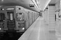
Tube in Torontoby odessit40Comment by dougi555: Could have been far better, slightly tilted to one side, just outta focus, potetial for a great B&W - still 6 coz it has an atmospshere i like |
| Photographer found comment helpful. |
| 05/16/2007 07:39:07 PM |
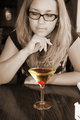
To Drink or Not To Drinkby odessit40Comment by odessit40: Originally posted by Monique64:
I think the photo itself needs a slightly crop on the top left. I like the sepia effect but because it is in similar tones to the drink it doesn't make the drink stand out. If the drink would have been a blue one for example with the red cherry it would have really popped out from the photo, which is the effect (Ithink) you were trying for. Hope you find this comment useful. |
Next time...I am going for Bombay Sapphire :) |
| 05/16/2007 07:24:47 PM |
To Drink or Not To Drinkby odessit40Comment by Monique64: I think the photo itself needs a slightly crop on the top left. I like the sepia effect but because it is in similar tones to the drink it doesn't make the drink stand out. If the drink would have been a blue one for example with the red cherry it would have really popped out from the photo, which is the effect (Ithink) you were trying for. Hope you find this comment useful. |
| Photographer found comment helpful. |
| 05/16/2007 06:18:53 PM |
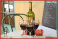
Ah, relaxationby odessit40Comment by odessit40: Originally posted by dahkota:
don't like the framing at all, but that's personal taste I guess. It cuts off the top of the bottle. Focus is good. Composition is a little static. Colors good, lighting works. I'm wondering at the why - why was this picture taken? What is the photographer trying to tell me? Maybe its a stock shot - selling a place? |
this picture is just something for myself - a year ago, i was with my friends in Nice and it was getting closer to lunch time. We stopped at a little family-owned cafe at the old part of Nice....We ordered a bottle of wine while we waiting for our food. Before the first toast, I just decided to put the glasses in front of the bottle and take this pic as a memory.
It's definitely something personal...and it conveys the story to..well, i guess me :)
|
Home -
Challenges -
Community -
League -
Photos -
Cameras -
Lenses -
Learn -
Help -
Terms of Use -
Privacy -
Top ^
DPChallenge, and website content and design, Copyright © 2001-2026 Challenging Technologies, LLC.
All digital photo copyrights belong to the photographers and may not be used without permission.
Current Server Time: 07/16/2026 01:09:16 AM EDT.