| Image |
Comment |
| 06/11/2003 10:03:41 PM |
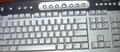
My keyboardby Crafty SueComment by wewillexplore: Should have made it level and cut out the top left corner - the desk part. Also - why cut off certain keys? Is your keyboard inherently more interesting than the one any of us are at? |
 Photographer found comment helpful. Photographer found comment helpful. |
| 06/11/2003 12:48:29 PM |
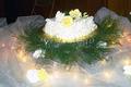
Cakeby Crafty SueComment by hawkida: The cake isn't the focus of the shot - nothing really is. There's little of the cake to be seen from this angle. The lighting is quite pretty but the detail on all the flowers is lost and the ferns look quite messy. The background is not very good at all - I can see a stepladder! I doubt this would ever make it onto a magazine cover. |
| 06/11/2003 08:37:51 AM |
Cakeby Crafty SueComment by gaja_tz: composition could be better. in the middle cake looks like overexposed. = 4 |
| 06/11/2003 05:34:57 AM |
Cakeby Crafty SueComment by Musicman: I think the cake is focused too high for the magazine cover.
Usually the magazine are taller than wider. |
| 06/11/2003 02:32:56 AM |
|
| 06/11/2003 01:42:35 AM |
|
| 06/11/2003 01:03:13 AM |
Cakeby Crafty SueComment by mindyparker: The title would cover the cake! Nice, but the cropping is not good for a magazine cover. Should be portrait not landscape |
| 06/10/2003 09:13:01 AM |
My keyboardby Crafty SueComment by alanfreed: In all honesty, it just doesn't look like much thought was put into this. Sorry to sound harsh... but it's "just a picture of a keyboard." The counterclockwise tilt feels uncomfortable, and the apparent use of flash created over-lit spots in the center of the shot. Again, I hate being harsh in comments, but if I score something low, I generally try to provide an explanation as to why... - 2 |
| Photographer found comment helpful. |
| 06/10/2003 07:56:18 AM |
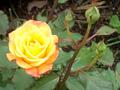
RioSamba rose.jpgby Crafty SueComment by mbardeen: Hi Sue
This is a very nice shot! I like the yellow of the rose contrasted with the green of the leaves. Also, the composition is very nice, having the diagonal of the plant stem to the right and the circle of the rose to the left creates loads of interest.
Good job!!
-Matt |
| Photographer found comment helpful. |
| 06/09/2003 07:02:38 PM |
|
| Photographer found comment helpful. |
Home -
Challenges -
Community -
League -
Photos -
Cameras -
Lenses -
Learn -
Help -
Terms of Use -
Privacy -
Top ^
DPChallenge, and website content and design, Copyright © 2001-2026 Challenging Technologies, LLC.
All digital photo copyrights belong to the photographers and may not be used without permission.
Current Server Time: 07/16/2026 12:11:45 AM EDT.