| Image |
Comment |
| 06/16/2003 12:46:12 AM |
Magic candleby Crafty SueComment by Malokata: The colors in this are kind of yucky. You might have considered a better background for this; the flash, the background, and the corner of something grey give this a real snapshot quality. |
 Photographer found comment helpful. Photographer found comment helpful. |
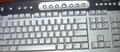
| 06/15/2003 10:37:58 PM |
My keyboardby Crafty SueComment by dsidwell: The slight tilt of the keyboard reallly helps add interest to this image. It seems slightly out of focus, though, and I think some more interesting lighting would add more drama and mood to the image, which would lead my thoughts beyond the photo, as it were, to think about deeper or broader things. |
| Photographer found comment helpful. |
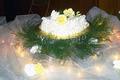
| 06/14/2003 07:11:06 PM |
Cakeby Crafty SueComment by nevileon: A nice photo, but the exposure is a bit imbalanced in places (bit dark in the back, and a little blown out up front). Food photography's really hard to be good at and you did a great job with what you had! |
| 06/14/2003 05:32:42 PM |
Cakeby Crafty SueComment by basia03: very nice cake and decorations... but it's not sharp enough to be considered for a cover... in addition, more attention needs to be paid to the background. 3. |
| 06/14/2003 12:49:15 PM |
Cakeby Crafty SueComment by kyrielle: The foreground on this one is very pretty; I would like the shot better if the backdrop were better controlled, and the photo was even. With the focus on the cake, it would help if it were horizontal in the photo (or further off the horizontal, if the sloping is deliberate) - as it is, it's clear that it angles (since it's so close to the top of the picture) but looks accidental. The folding chair or stepladder (can't tell which) in the background really stands out as well. The same shot might have worked better if you'd brought a chair or two (or something) close in behind the cake, and draped them with a length of fabric in a suitable color (maybe dark brown or black, here) to prevent the background from intruding on the effect. |
| 06/14/2003 06:41:27 AM |
My keyboardby Crafty SueComment by Annida: Yes, that's your keyboard! I like it! .. I think this photo would have worked better if you used external lighting.. like a lamp? instead of the flash (the flash tends to bounce light off things like chrome). I also think it would have worked better if you had rotated the picture a bit, to get rid of the desk in the top left corner. Technically, keyboards don't really make fascinating subjects :) good try though! |
| Photographer found comment helpful. |
| 06/13/2003 07:49:55 AM |
Cakeby Crafty SueComment by Luckydog: Bit too much lighting on the cake i feel. Maybe a tighter crop or closer in to get rid of all that tuele (sp?) and the chair in the background |
| 06/12/2003 09:33:57 PM |
Cakeby Crafty SueComment by GinaRothfels: Perhaps you could have got in a little closer. Also the lighting seems a bit harsh and the cake looks rather overexposed. |
| 06/12/2003 09:32:46 PM |
My keyboardby Crafty SueComment by inspzil: I'm looking at one of these right now. So I'm thinking I don't need a picture of it too. The keyboard is enough. This is awful bright too... |
| Photographer found comment helpful. |
| 06/11/2003 11:34:39 PM |
Cakeby Crafty SueComment by qm_kitten: This has the makings of a great shot, but you might have tried to get a different angle. For instance, looking downward upon the cake would have provided a much better background than the wall and the folding chair. =) Good work, though! |
Home -
Challenges -
Community -
League -
Photos -
Cameras -
Lenses -
Learn -
Help -
Terms of Use -
Privacy -
Top ^
DPChallenge, and website content and design, Copyright © 2001-2026 Challenging Technologies, LLC.
All digital photo copyrights belong to the photographers and may not be used without permission.
Current Server Time: 07/16/2026 02:53:10 AM EDT.