|
|
|
Showing 1511 - 1520 of ~1602 |
| Image |
Comment |
| 11/15/2006 09:57:19 PM | |  Photographer found comment helpful. Photographer found comment helpful. |
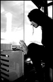
| 11/15/2006 03:45:07 PM | falling feels like flying...by silverfoxxComment by Azrifel: Originally posted by silverfoxx:
doesn't that thing, that circle above my head give some assosiations with hanging (in all it's meanings)? but you are probably right and it shouldn't be there. the message should be clear like in the army, 2 secs for one photo and you are done.
:(( |
That is what scores highest. If for you it is all about the scores than you have to shoot to please the crowd. If you photograph like you want to, work out you ideas in a way they please you, present it here.... Yes, maybe you do not get over 6 at dpc, but most of the times you will be rewarded with a comment or favourite of someone who does "get it", does appreciate it, who shares your vision.
I do know of several pg's who after winning several ribbons felt that they were not presenting their work like they wanted to, they were just shooting to please the crowd. Yeah they had high scores and ribbons, but were not 100% happy anyway.
While I made the previous comment it did cross my mind that the little circle could have something to do with the "hanging", but as it is only a small detail and saw no further relation with you (like a rope or something) I dismissed it as not important.
| | Photographer found comment helpful. |
| 11/15/2006 03:38:28 PM | the ghost of decadenceby silverfoxxComment by silverfoxx: I'm not saying this is art. I'm not sayig this is something great but highly underrated. I don't know what this is. this is not my best photo. maybe it was just a bad try. but I hope I will learn from it.
it's an indian stick for room, santal. |
| 11/15/2006 03:30:57 PM | falling feels like flying...by silverfoxxComment by silverfoxx: doesn't that thing, that circle above my head give some assosiations with hanging (in all it's meanings)? but you are probably right and it shouldn't be there. the message should be clear like in the army, 2 secs for one photo and you are done.
:((
|
| 11/15/2006 03:25:17 PM | the ghost of decadenceby silverfoxxComment by Azrifel: Originally posted by silverfoxx:
thank you for you comments Azrifel!
the photo should look chaotic, with no balance, no clear details. I want it this way. you shouldn't know what I have in my hand, you should guess what this is and what I was doing with it. it should look dark and unsaid, unclear and weird.
:((( |
Now I understand. But people at dpc don't expect that in a challenge like this. Without a caption it is also very hard to tell what the intend of the photographer is.
At dpc you need to make your message clear in two seconds. If the viewer doesn't see it in two seconds or you cannot make him stop for any longer the voter goes on and gives it an everage score. That's the downside of a competition orientated site as opposed to an art judgement site.
Let me guess.....
Is it a cigaret on a really long stick and you are smoking it?
| | Photographer found comment helpful. |
| 11/15/2006 03:12:17 PM | falling feels like flying...by silverfoxxComment by Azrifel: This would get a 5 from me.
Yes it has high contrast, but is also has lost all structure and form in the dark parts (not really the intent of high contrast). I can also not tell what this scene is about, I have no clue. What is above your head? It has no meaning to me, it should not be in the picture, it is distracting. | | Photographer found comment helpful. |
| 11/15/2006 03:11:59 PM | the ghost of decadenceby silverfoxxComment by silverfoxx: thank you for you comments Azrifel!
the photo should look chaotic, with no balance, no clear details. I want it this way. you shouldn't know what I have in my hand, you should guess what this is and what I was doing with it. it should look dark and unsaid, unclear and weird.
:((( |
| 11/15/2006 03:08:53 PM | purple kabukiby silverfoxxComment by Azrifel: My main point of critique on this shot would be the lighting. It is very harsh on the face. It is also very dominant on the left side of the frame, where there is too much light on the arm, cloth and thing in the hand. This draws the eye away from the person.
The composition is basically ok, but I do not like that elbow pointing toward me. I can live with the border, but don't like the noise (I like noise sometimes, just not here). | | Photographer found comment helpful. |
| 11/15/2006 03:03:07 PM | the ghost of decadenceby silverfoxxComment by Azrifel: I gave this a five, because the contrast is too hard.
Too much of the main subject for this challenge (portrait -> person) is in very dark shade. The part of the person that is lit, contrasts too hard with the shadows. Same goes for the background like vs subject light. I'd like to see more balanced lighting.
The scene also looks chaotic. What is that background about, what is it that you are holding in your hand, are you poking it in your eye (that's what it looks like).
| | Photographer found comment helpful. |
| 11/15/2006 02:57:09 PM | the frozen echo of the flower balletby silverfoxxComment by Azrifel: I didn't vote on this challenge, let's start with that.
I really like this photo, the contradiction of the cold vs the summer clothes, the freshness of the pose/dance, the beautiful background and the balance of the blue and red/orange tints. the composition is quite good.
The reason why it didn't score higher is probably because you, dancing around on that snow, are the main subject here. You draw all the attention. The background, with the reflection, becomes the secondary subject. For this picture this is a great background, but challengewise the background is not the main focal point, not the in your face subject and therefore the whole photo gets rated lower.
Personally, I really don't like the border. The bleu tone of it is so bright that it pulss the eye out of the frame. Use a darker tone of blue or just black or no border at all.
I'd give it a 6 in this challenge, otherwise it would be a 7+ | | Photographer found comment helpful. |
|
Showing 1511 - 1520 of ~1602 |
Home -
Challenges -
Community -
League -
Photos -
Cameras -
Lenses -
Learn -
Help -
Terms of Use -
Privacy -
Top ^
DPChallenge, and website content and design, Copyright © 2001-2026 Challenging Technologies, LLC.
All digital photo copyrights belong to the photographers and may not be used without permission.
Current Server Time: 07/23/2026 10:32:52 PM EDT.
|