| Image |
Comment |
| 12/25/2006 12:09:44 AM |
|
 Photographer found comment helpful. Photographer found comment helpful. |
| 12/18/2006 02:22:17 PM |
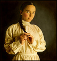
~the way you have never seen me~ to James with true love, from Russiaby silverfoxxComment by Pixelstate: Hey Svetlana.
This is exceptional... I agree with the critique club comment that it is a little too tight at the top... but that is being picky.... regarding votes, I think that in some ways your work is too artistic for this forum. I guess that most voters don't spend enough time on each photo to interpret the deeper meaning... as kteach mentions.. too out of the box for a 5 second view and vote...
Have you considered posting to other sites... your work would suite photo.net rather well for example. |
| Photographer found comment helpful. |
| 12/18/2006 02:16:02 PM |
|
| Photographer found comment helpful. |
| 12/16/2006 07:09:56 PM |
~the way you have never seen me~ to James with true love, from Russiaby silverfoxxComment by kteach: Greetings from the Critique Club!
When I first voted on this one, I didn't see the connection to the challenge, and I think that may be the case of why this didn't score higher. When I think of James Bond, I think of movies, and maybe even some film grain for the older movies, but not a painted canvas picture.
That being said, I think this is a wonderful portrait, which really portrays a wonderful feeling. The pose, clothing, jewelery and lighting are all wonderful, and the treatment you've used to give it that canvas look feels authentic, which I often find not to be the case when some of those filters are used.
I think the biggest criticism I have is the cropping. It feels tight at the top, and too wide to the right. I'm not sure if I like so much being shown below the waistline... I might have cropped a bit off of the bottom to give more room at the top?
Overall, this was a creative interpretation for the challenge, but perhaps a bit too out of the box for some voters. The photo was well thought out, and beautifully processed. |
| Photographer found comment helpful. |
| 12/16/2006 07:42:41 AM |
|
| Photographer found comment helpful. |
| 12/14/2006 02:11:36 PM |
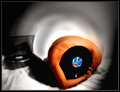
the dominance of the shape projecting onto the blue, as seen from aboveby silverfoxxComment by kausikmpi: From Critique club,
Hi,
The most important part of this work is the concept itself. Which is presented in a very original way. As correctly pointed out by a critique, this resembles magritte in terms of juxtaposition of two different objects in an odd position (here there is also a contrast in color) to create a specific illusion. The positioning of colors, rich blue of the ball with a near neutral color of the body creates an uinteresting picture.
I am a student of composition, so i try to avoid extreme symmetry in any picture, here the human form has extreme symmetry, till at least the hand starts, which makes one half less interesting. This is not so with the ball as it has been lit differentially from two directions. If this differential assymetry is part of the message of the picture then I would rather not comment on it. I think this image captures attention but it has even more potential if the negative spaces on either sides are a little different.
Technically nothing according to me can be improved this is as close to perfect as it can get.
Regards
Kausik |
| Photographer found comment helpful. |
| 12/13/2006 05:48:36 PM |
|
| Photographer found comment helpful. |
| 12/13/2006 05:48:21 PM |
|
| Photographer found comment helpful. |
| 12/12/2006 10:07:09 PM |
|
| Photographer found comment helpful. |
| 12/11/2006 05:48:46 PM |
|
| Photographer found comment helpful. |
Home -
Challenges -
Community -
League -
Photos -
Cameras -
Lenses -
Learn -
Help -
Terms of Use -
Privacy -
Top ^
DPChallenge, and website content and design, Copyright © 2001-2026 Challenging Technologies, LLC.
All digital photo copyrights belong to the photographers and may not be used without permission.
Current Server Time: 07/24/2026 10:18:05 AM EDT.