| Image |
Comment |
| 06/02/2007 07:35:52 AM |
|
| 06/01/2007 05:38:10 PM |
|
| 06/01/2007 12:14:59 AM |
|
| 05/31/2007 02:30:09 AM |
|
| 05/30/2007 02:32:33 PM |
|
| 05/30/2007 10:26:08 AM |
|
| 05/29/2007 05:37:24 PM |
|
 Photographer found comment helpful. Photographer found comment helpful. |
| 05/29/2007 12:30:08 PM |
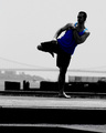
Karatekidby ladpupmoeComment by crik: Nice image for the username. Might work better as a full silhoutte or with more light on the person. |
| Photographer found comment helpful. |
| 05/24/2007 04:16:12 PM |
|
| Photographer found comment helpful. |
| 05/23/2007 12:50:11 PM |
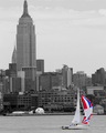
Sailing on the Hudsonby ladpupmoeComment by sidpixel: Nice vibrant sail against the mono background. I think a lower viewpoint and more OOF background would have given it more impact. Would it benefit from straightening, or perhaps it's just my weary old lamps. Good luck |
| Photographer found comment helpful. |
Home -
Challenges -
Community -
League -
Photos -
Cameras -
Lenses -
Learn -
Help -
Terms of Use -
Privacy -
Top ^
DPChallenge, and website content and design, Copyright © 2001-2026 Challenging Technologies, LLC.
All digital photo copyrights belong to the photographers and may not be used without permission.
Current Server Time: 07/16/2026 09:29:47 PM EDT.