| Image |
Comment |
| 07/25/2007 04:30:03 PM |
|
| 07/25/2007 08:30:07 AM |
|
 Photographer found comment helpful. Photographer found comment helpful. |
| 07/24/2007 10:29:19 PM |
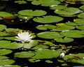
Can you spot the frog on the lily padsby ladpupmoeComment by violinist123: Shot meets the challenge. The lily pads give a nice sense of rhythm to the scene. Technically the shot needs some work. The flower is overexposed and almost completely without detail. Also it might be more pleasing were the subject (the flower) on a thirds intersection. In the lower left it would nicely anchor the shot. |
| Photographer found comment helpful. |
| 07/24/2007 02:04:17 PM |
Self Portrait by ladpupmoeComment by Mephisto: ok now seeing it in the larger version, not just the thumbnail, i'm starting to like this one. it's not the typical beautiful-face-of-some-25-years-old-blonde, but a really well done portrait of an "average" woman, which tells a lot of her (your) personality. technically seen, the only thing that bothers me a bit is the hair beeing a bit dark on her backside. the b&w works really well and the background (though a bit tilted...) gives a good softy contrast to the rather harsh lighting on her face.
overall i think it's one of the best i've seen in this challenge and gets a 9 from me. good luck :) |
| Photographer found comment helpful. |
| 07/24/2007 02:09:52 AM |
|
| Photographer found comment helpful. |
| 07/23/2007 11:12:13 PM |
|
| Photographer found comment helpful. |
| 07/23/2007 06:26:43 PM |
Self Portrait by ladpupmoeComment by SaraR: i am not keen on this photo - the slotted blind behind you does little to compliment the portrait, and your pose looks rather uncomfortable, as thoug you didn't really want to be being photgraphed. |
| 07/23/2007 11:49:37 AM |
|
| 07/20/2007 04:40:24 PM |
|
| Photographer found comment helpful. |
| 07/19/2007 08:11:35 PM |
Self Portrait by ladpupmoeComment by dtremain: Interesting choice of vertical blinds for the background and a striped top. I'd have like to see more light on the hair. |
Home -
Challenges -
Community -
League -
Photos -
Cameras -
Lenses -
Learn -
Help -
Terms of Use -
Privacy -
Top ^
DPChallenge, and website content and design, Copyright © 2001-2026 Challenging Technologies, LLC.
All digital photo copyrights belong to the photographers and may not be used without permission.
Current Server Time: 07/15/2026 11:58:20 PM EDT.