| Image |
Comment |
| 08/21/2002 03:56:00 PM |
v .00by GordonComment by Willa: This is kind of interesting, bt there is too much blank space at the top. |
| 08/21/2002 03:47:00 PM |
v .00by GordonComment by Amphian: Great focus and lighting. I love the minimalism of this shot. |
| 08/21/2002 01:34:00 PM |
|
| 08/21/2002 09:25:00 AM |
v .00by GordonComment by autool: Composition: Subject Placement, Cropping, Background8, Technical: Focus, Exposure, Lighting, Processing9, Challenge: Does your entry meet it?10, Appeal: Is it Interesting, Motivating, Etc.? 7, Total Averaged Rating9. Autool |
| 08/20/2002 04:21:00 PM |
v .00by GordonComment by goodtimecharlee: great image. strong composition with strong impact. i fear you might get slammed for this though. not everyone appreciates this style. i'm sure you will get many simple critiques on what you did wrong. stylistically i love this. i really like the blown out background. i hope you do well in the challenge. if not, hang in there. you have achieved a pretty unique style which is a rarity on this site. 9 |
| 08/20/2002 03:33:00 PM |
|
| 08/20/2002 03:14:00 PM |
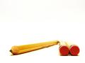
v .00by GordonComment by FranziskaLang: wow, we do have a lot of admin notes this week. i just totally love your photo. the composition is awesome, although i can see why some people think it's a border, i'm sure you will enlighten us on monday as to how you achieved the effect. very nice selective DOF, and placement of the pencils, but i probably would've chosen a 640x427 format to just slightly reduce the negative space w/out loosing the concept. also, your paper is ever so slightly wavy under the diagonal pencil. but i'm just nitpicking here. my top 5 this week. -- gr8photos (10) |
| 08/20/2002 02:41:00 PM |
v .00by GordonComment by RedRuthann: Very simple, clean and well done. Great composition and angle. I like it very much. The choice of exposure suits this photo well. Great work. 10 Ruthann |
| 08/20/2002 02:26:00 PM |
|
| 08/20/2002 10:45:00 AM |
v .00by GordonComment by jmsetzler: this is a really neat concept but it looks like it was cut and pasted into a new white frame in software... this is illegal... I score the shot an 8 just incase it is legal though... good idea :) - jmsetzler |
Home -
Challenges -
Community -
League -
Photos -
Cameras -
Lenses -
Learn -
Help -
Terms of Use -
Privacy -
Top ^
DPChallenge, and website content and design, Copyright © 2001-2026 Challenging Technologies, LLC.
All digital photo copyrights belong to the photographers and may not be used without permission.
Current Server Time: 07/17/2026 06:42:09 PM EDT.