SoBe Slantby
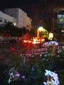
JeileenComment by UberFish: Didnt vote this week, but this one caught my eye. The image itself does deserve its low ranking, but theres lots of good stuff in the image that have the makings of a really good 'art' peice (I.e. one that will score just as low on DPC).
The blue flowers are really good, especially the one in the bottom right, and they place points of interest around the field, and also complement the reds. Perhaps placing the bottom left one exactly in the bottom left corner would help. They are there to balance and contrast the reds and yellows in the 'action' part of the frame.
The big red stem is a problem, it runs across the main element, and isnt really leading the eye anywhere. It would be better if it was vertical up the right side, creating a barrier to stop the road leading the eye out of frame (although I think its good for the road to be doing this).
The building in top left is not helping anything, its not bright enough to be balancing the weight of the blue flowers, and its blank space contests for the viewers attention. It could serve a purpose as a background silhouetting the red flower spike.
The lights are excellent, not to fuzzy not too sharp. That area could be placed better to show the contrast with the blue flowers, moving it towards the top right. Perhaps a longer exposure would have bled the red tail lights out along the road, leading the eye into the picture.
The top left is OK, but I'd like to see more of the top of the palm, the cropping on the right is good, not too much of that building, but enough to stop a blank space.