| Image |
Comment |
| 05/26/2003 10:59:36 PM |
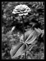
Wildflowerby BudweezerComment by casualguy: Decent lighting and detail. The composition leans a little heavy on the centeredness (for a lack of a better work) for my tastes. |
 Photographer found comment helpful. Photographer found comment helpful. |
| 05/26/2003 04:24:09 PM |
|
| Photographer found comment helpful. |
| 05/26/2003 04:11:26 PM |
|
| Photographer found comment helpful. |
| 05/26/2003 06:24:39 AM |
Wildflowerby BudweezerComment by aurora: seems a little unbalanced, the lwaves on the bottom are so much bigger than the bloom, but still a good pic 7 |
| Photographer found comment helpful. |
| 05/26/2003 12:40:57 AM |
|
| Photographer found comment helpful. |
| 05/26/2003 12:38:45 AM |
Wildflowerby BudweezerComment by jmsetzler: Phenomenal image... this flower is just beautiful in black and white... the lighting on the blossom and the shadows created by it create the perfect amount of contrast, and create a nice resting place for my eye in this image... The depth of field is shallow enough to make this flower stand out nicely against the background as well.... great work :) = 10 |
| Photographer found comment helpful. |
| 05/16/2003 12:35:13 AM |
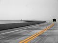
Wakulla Springs: The Real Floridaby BudweezerComment by christo: A very good entry!
First: the subject. To choose this boat was a very good move. It fits perfectly the theme, and has a touristic appeal which makes you want to go there and/or makes you feel like you are there. This is what a postcard is meant for! So very good choice.
The composition is maybe the main reason why this pic works well. The angle you chose to capture the boat makes me feel like I was about to embark. 2/3 of the picture is filled with water, which totally makes sense here since it is finally the main subject. Maybe one thing to improve this composition though. It's been mentioned in the comments:
this image doesn't have the usual postcard proportions. I'm sure it would have looked much better with more rectangular proportions. Too bad.
The exposure is perfect. You wonderfully capture the texture of water and its reflections, while the sky is not washed out. Very well done.
The only reason I can think of why this entry didn't do better despite its undeniable multiple qualities is the lack of wow factor. Compared to spectacular night city lights reflections, this entry has less immediate appeal. But it is definitely very good and I wish you had done better with the votes.
Good luck for your future entries.
The Critique Club |
| Photographer found comment helpful. |
| 05/11/2003 02:41:33 PM |
|
| Photographer found comment helpful. |
| 05/11/2003 05:18:36 AM |
Round the Bendby BudweezerComment by e301: Hi Max - critique club ...
I'm no great fan of the selective desaturation technique, but here it's effective and useful - emphasise the curves.
I'd back up the point about the horizon line - it seems a little arbitrary to put it dead centre: if you could have got a bit higher and placed the horizon further up the shot there might have been even more impact.
The other down-side is tha amount of noise in the sky, and those big blurry lumps. I wonder if you've over-processed the shot, or cropped out too much for the resolution of your camera. Worth trying a programme like Neatimage, which is excellent at getting rid of just that stuff.
The space and emptines you've caught is excellent though, good work.
ed |
| Photographer found comment helpful. |
| 05/10/2003 01:55:46 AM |
|
| Photographer found comment helpful. |
Home -
Challenges -
Community -
League -
Photos -
Cameras -
Lenses -
Learn -
Help -
Terms of Use -
Privacy -
Top ^
DPChallenge, and website content and design, Copyright © 2001-2026 Challenging Technologies, LLC.
All digital photo copyrights belong to the photographers and may not be used without permission.
Current Server Time: 07/15/2026 03:41:53 PM EDT.