| Image |
Comment |
| 04/07/2003 12:51:38 AM |
|
 Photographer found comment helpful. Photographer found comment helpful. |
| 04/06/2003 11:32:26 PM |
|
| 04/06/2003 08:36:51 PM |
Rust and Skyby BudweezerComment by stephan: I think a plain blue sky without the clouds would look better and enhance the abstract look of the photo. Also it seems that it's not perfectly symmetric, a step to the right could have helped. Otherwise a good photo. |
| Photographer found comment helpful. |
| 04/06/2003 03:19:56 PM |
|
| Photographer found comment helpful. |
| 04/06/2003 01:38:22 PM |
Rust and Skyby BudweezerComment by KimInNB: this would be perfect for PI!!! Love the texture on the metal & rust and the wonderful background. |
| Photographer found comment helpful. |
| 04/06/2003 01:05:44 PM |
|
| Photographer found comment helpful. |
| 04/06/2003 05:49:23 AM |
|
| 04/06/2003 12:21:24 AM |
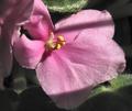
African Violetby BudweezerComment by DennisF: I always have a hard time doing African violet photos - the surface is so shiny. I think if you look at the other flower shots in this challenge you will see notable differences in the area of composition and choice of background, focus acros the subject, and attention to detail such at the shadows across the flower. Keep up the good work. |
| Photographer found comment helpful. |
| 04/05/2003 06:55:01 PM |
|
| Photographer found comment helpful. |
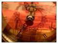
| 04/05/2003 11:57:29 AM |
Reflections on Timeby BudweezerComment by karmat: CRITIQUE CLUB CRITIQUE
by karmat
COMPOSITION
The composition of this is really strong. You have filled the frame with the main object, and your subject is easily identifiable.
TECHNIQUE
The colors here are wonderful. The orange of the desert scene really complements the brassy/gold of the clock hands. Also, I like that the hands of the clock are so well focused. It gives the eyes something distinguishable to "rest" on. Choosing a desert scene, such as you have, works well because the reflection does not have to be in focus to be identifiable. Being slightly "soft" adds to the overall warmth, I think. My only suggestion would be to reposition the hands. I think the "short" hand needs to be more around the 11 or 12 (a normal 3 o'clock position, but I see your clock is on its side), and the "long" hand around the 6.
OVERALL EFFECT
I did notice the tiled in the background in voting, but it wasn't too distracting. If you wanted to eliminate it, possible laying a similarly colored towel or cloth down may have helped to "disguise" it. Otherwise, it adds some "surrealness" to the shot, and makes the viewer stop and look a little more.
Good work and best wishes in future challenges.
karmat |
| Photographer found comment helpful. |
Home -
Challenges -
Community -
League -
Photos -
Cameras -
Lenses -
Learn -
Help -
Terms of Use -
Privacy -
Top ^
DPChallenge, and website content and design, Copyright © 2001-2026 Challenging Technologies, LLC.
All digital photo copyrights belong to the photographers and may not be used without permission.
Current Server Time: 07/15/2026 10:55:19 PM EDT.