| Image |
Comment |
| 05/02/2007 08:36:21 AM |
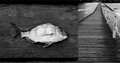
Fishby RetroesqueComment by gsal: Very artsy and the two images go well together. The curved lines of the fish and the straight lines of the bridge make this very interesting. Yes, I like it. |
 Photographer found comment helpful. Photographer found comment helpful. |
| 05/02/2007 08:25:02 AM |
|
| Photographer found comment helpful. |
| 05/02/2007 07:52:08 AM |
Fishby RetroesqueComment by UNCLEBRO: i thought the fish had a human face for a minute!!!
or maybe i'm not fully awake yet :-)
a good triptych minus one image :-) Message edited by author 2007-05-02 11:33:11. |
| Photographer found comment helpful. |
| 05/02/2007 07:14:22 AM |
|
| Photographer found comment helpful. |
| 05/02/2007 07:08:26 AM |
Fishby RetroesqueComment by boysetsfire: there is a bridge under the westgate?
this is cool, maybe crop that small part of the decking off at the bottom as without it the gaps would look like a natural black border.
i like
nick |
| Photographer found comment helpful. |
| 05/02/2007 06:24:35 AM |
|
| Photographer found comment helpful. |
| 05/01/2007 10:08:52 PM |
|
| Photographer found comment helpful. |
| 05/01/2007 08:21:28 PM |
|
| Photographer found comment helpful. |
| 05/01/2007 07:50:13 PM |
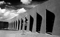
Strongby RetroesqueComment by Tlemetry: Very interesting architecture. The shapes are very eye catching and good contrast. The little squares inside add some interest to the darkness that I find appealing.
the poor little tree is overwhelmed, in my opinion, and gets lost against the strong details of the wall. I wish it was down on the left side where the wall leads your eye. I probably would have cropped off the side where the wall ends, to make it look as if it goes on and on. but thats just me.
The clouds are nicely moody, but the blues are just a bit to dark in the background. However, the sky did not attract my attention at all. I had to go look for it. |
| Photographer found comment helpful. |
| 05/01/2007 06:13:01 PM |
Strongby RetroesqueComment by littlegett: The lines of the building are very nice, but I am wondering about maybe a stronger angle (you closer to the building) and a different part of day, so the gradulant of the light on the building is gone. For me it just doesn't balance the image very well. Personally I also think the sky is a bit dark. However I find that tree marvelous beyond compare. |
| Photographer found comment helpful. |
Home -
Challenges -
Community -
League -
Photos -
Cameras -
Lenses -
Learn -
Help -
Terms of Use -
Privacy -
Top ^
DPChallenge, and website content and design, Copyright © 2001-2026 Challenging Technologies, LLC.
All digital photo copyrights belong to the photographers and may not be used without permission.
Current Server Time: 07/18/2026 10:22:14 PM EDT.