|
|
|
Showing 231 - 240 of ~271 |
| Image |
Comment |
| 09/28/2006 09:43:50 PM | |  Photographer found comment helpful. Photographer found comment helpful. |
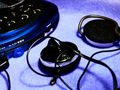
| 09/27/2006 07:04:46 PM | Portable Musicby SquishyBComment by Neil: You mentioned you had not received much feedback--so here's my take on this shot (I didn't vote).
Subject material. Fits the challenge, Placement of "Still life" is interesting. It's rather "static" though. Doesn't tell a story or make the viewer identify with it, e.g., that there's sound coming out, the music that's playing, the situation (e.g., taking a picture of someone doing an activity with headphones on is something we all identify with--seeing anyway).
Technical. This seems to lack much continuous tonality. The blacks are very black on my calibrated monitor; I don't see any reflected light on the black surfaces showing me their texture or shape. That might be from using an autolevels, or simply setting the black level too aggressively. That's perhaps the biggest issue with this shot. There's a lot of black, and lacking any light, it makes it flat and dark.
There seems to be little tonality in the blue areas as well. Not quite posterized, but there appears to be two dominent blues, and only a little in-between tonality.
I can't tell if you did this on purpose, or if it could have been done better with you taking more control of levels, for example, if one of your tools is doing this, perhaps due to some automatic setting.
Hope that helps. If you want me to look at the original and see what the levels issue is, I'd be happy to. Just send me a PM.
| | Photographer found comment helpful. |
| 09/27/2006 12:14:20 PM | |
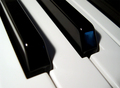
| 09/26/2006 04:10:59 PM | Lines and Angles in Perfect Harmonyby SquishyBComment by ambaker: Critique Club Review:
Either focus or depth of field is a little off. A smaller f-stop would have helped a lot here.
Lighting is dramatic. But the first black key doesn't show enough detail for me. I noticed one person was troubled by the reflection in the second key. To me it gices some reference for the shape of the key face.
Overall I like the picture. The composition is good, the whites are nice and white. It's the focus issue I notice the most. | | Photographer found comment helpful. |
| 09/23/2006 10:53:58 PM | | | Photographer found comment helpful. |
| 09/23/2006 02:51:02 AM | | | Photographer found comment helpful. |
| 09/22/2006 12:22:43 PM | | | Photographer found comment helpful. |
| 09/20/2006 10:39:36 PM | | | Photographer found comment helpful. |
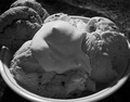
| 09/18/2006 10:48:39 AM | Cookies 'n Creamby SquishyBComment by atupdate: Hello from the Critique Club,
Go figure, I just commented on your image earlier this AM and now it comes up at random as my Critique Club assignment. Since I've already posted my critique, feel free to PM me for a free critique on any image in the future.
Tim | | Photographer found comment helpful. |
| 09/18/2006 06:52:04 AM | Cookies 'n Creamby SquishyBComment by atupdate: Lila,
You received several comments during the challenge on what could be improved with this entry. I agree with those that think this subject would have been better presented in color. But, reading your forum post, I realize that you didn't like the colors and decided to do a B&W conversion. First, you had two of the best help you improve your image as a B&W so I won't rehash that information. However, there is an excellent tutorial by fotomann here that should help you do it yourself next time.
First, lets address why you didn't like the color version, red tablecloth, white ice cream, brown cookie. I'm going to assume the bowl was white as well. If you could have found a bowl with a complementary color (light blue, green, red) for the cookies, it would have acted as a natural frame for the main subjects. Then you could have used a black or white background to highlight the bowl. Another option would be to shoot this image more from the side. This would have given the ice cream some depth by providing height to the main subject. This would have allowed you to shoot the bowl in profile and bring more color into the image.
One other suggestion, whenever I shoot a still life, I throw away my flash unit. Generally, still lifes look better if the lighting comes somewhat from the side. I bought a couple of halogen work lamps and reflect them off walls or poster board to help soften their light. These can be purchased at any home improvement store for $10 to $15 a piece. Please note, if you plan to do this you will probably need a tripod as well.
Let me know if you have any questions regarding my comments.
Tim
| | Photographer found comment helpful. |
|
Showing 231 - 240 of ~271 |
Home -
Challenges -
Community -
League -
Photos -
Cameras -
Lenses -
Learn -
Help -
Terms of Use -
Privacy -
Top ^
DPChallenge, and website content and design, Copyright © 2001-2026 Challenging Technologies, LLC.
All digital photo copyrights belong to the photographers and may not be used without permission.
Current Server Time: 07/16/2026 03:07:06 AM EDT.
|