| Image |
Comment |
| 10/09/2006 07:49:03 AM |
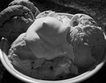
Cookies 'n Creamby SquishyBComment by Cheerz: I had to agree with Tim on his comments.
Read up on the B/W post processing techniques, it'll help a lot.
The subject would work well as a coloured photo. Thus, a B/W representation would not do very well here...
I would prefer a different angle for this shot to make the topping a little more "pleasing" to the eyes..
You're welcomed to send me the original and see what I can do with it..
Cheers
eric |
 Photographer found comment helpful. Photographer found comment helpful. |
| 10/09/2006 07:45:21 AM |
Lines and Angles in Perfect Harmonyby SquishyBComment by Cheerz: Simple and effective.
I love this shot.
A pity you don't have the use of an external flash. it'll work wonders.
I noticed that you're shooting:
Aperture: f/2.8
ISO: 100
Shutter: 1/54 sec
Try to do an aperture-priority and close the aperture to around 9... and see what you'll get. Remember to use a tripod. |
| Photographer found comment helpful. |
| 10/09/2006 07:43:01 AM |
Portable Musicby SquishyBComment by Cheerz: The composition of the photo can be improved slightly. ie. the wire is a little messy, causing the photo to be a little disorganized.
I'm not a big fan of the post-processing. The toning of the photo makes it a little harsh to look at.
can i have a look at the source photo? would like to see if we can improve on the post-processing.. |
| Photographer found comment helpful. |
| 10/09/2006 07:36:38 AM |
Roxoby SquishyBComment by Cheerz: The problem with abstract at DPC is that it doesn't please everyone and it usually gets voted down when "we" don't get it.
but... "Hello... This is an abstract!"
I feel that.. don't let the score bother you.. I felt that it should have been at least a 5.. so.. hang in there.
Technically, there could be a few improvements.
1) the lighting to show less of the whites
2) too much spaces work against abstracts. Zoom in and give it a really nice tight crop..
Hope this helps.. |
| Photographer found comment helpful. |
| 10/06/2006 04:49:43 PM |
Roxoby SquishyBComment by DrAchoo: The technicals: I think a big part of your issue is actually the halogen lamp. They give off such a shifted color that sometimes it's hard to work with, especially when you are going for purple (cool) rather than yellow (warm). What happens in PP is you get pixelation and saturation problems in the highlights like you see here. There are also noise issues, which seem to be a no-no on DPC.
The feel: nicely abstract. I may have included more of the paper towel and less negative space along the bottom.
The game: abstracts always have a tough time outside abstract challenges here on DPC. |
| Photographer found comment helpful. |
| 10/05/2006 03:13:13 PM |
|
| Photographer found comment helpful. |
| 09/29/2006 04:28:28 PM |
Roxoby SquishyBComment by mist: Meets the challenge. A hard image for me to look at though. Bit too abstract for me. |
| Photographer found comment helpful. |
| 09/29/2006 10:28:17 AM |
Roxoby SquishyBComment by mpreslar: Interesting. Not sure what it is, but interesting. I think there is too much negative space to be effective... |
| Photographer found comment helpful. |
| 09/29/2006 06:13:10 AM |
Roxoby SquishyBComment by xvix: Boa foto. a parte do liquido está com algum ruido e é pena o canto superior esquerdo aparecer desfocado, dado que é para onde o olhar é atraido. 5 p |
| Photographer found comment helpful. |
| 09/28/2006 09:56:56 PM |
Roxoby SquishyBComment by 'Pong: Interesting concept. I would attempt increasing DoF and sharpening to make the detail stands up. |
| Photographer found comment helpful. |
Home -
Challenges -
Community -
League -
Photos -
Cameras -
Lenses -
Learn -
Help -
Terms of Use -
Privacy -
Top ^
DPChallenge, and website content and design, Copyright © 2001-2026 Challenging Technologies, LLC.
All digital photo copyrights belong to the photographers and may not be used without permission.
Current Server Time: 07/16/2026 06:14:02 AM EDT.