| Image |
Comment |
| 11/02/2006 03:10:33 PM |
|
 Photographer found comment helpful. Photographer found comment helpful. |
| 11/02/2006 11:12:02 AM |
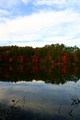
Reflections of Changeby SunshyneComment by eqsite: This is a nice composition, but the trees are a little too dark to really make out. Also, the sky seems a little over exposed. |
| Photographer found comment helpful. |
| 11/02/2006 09:14:41 AM |
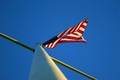
Freedom fliesby SunshyneComment by glad2badad: It's "ok". Interesting POV. The cross bar is distracting but at least you used it too advantage to form a diagonal line of interest in your composition. Good luck in the challenge. |
| Photographer found comment helpful. |
| 11/01/2006 09:47:27 PM |
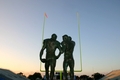
Fallen Captainsby SunshyneComment by Sunshyne: For those who commented on my photo...
I made the grave mistake of trying to figure out what the voters would say/prefer, and didn't enter my prefernce of my shots for this challenge. My favorite had the statues completely centered with the posts framing them, but my thought process was that I'd probably get "hammered" (using fracman's terminology) b/c things were centered! Just proves that I should enter what I like instead of trying to enter what I think the voters would like to see.
Also, a couple of people commented about the feet being cropped out...the statue is set on a very high base (about 3'), so in order to crop out the base and get the rest of the shot in, I have to crop out the feet/shoes, too. Honestly, though, I never noticed it when I was entering it/before comments were made.
Thank you to all for commenting - especially the constructive critique to help me improve.
Marjorie |
| 11/01/2006 10:34:36 AM |
|
| Photographer found comment helpful. |
| 11/01/2006 03:59:36 AM |
Reflections of Changeby SunshyneComment by Falc: You have exposed for the sky here, which has put the main interest into the dark. Try a neutral density graduated filter to even out the differences between sky and foreground |
| Photographer found comment helpful. |
| 10/31/2006 09:52:20 PM |
Pick Me - I stand out among the others!by SunshyneComment by rox_rox: 4.9?! This must be a bad joke! This image rocks! The color contrast and composition are great. I'm sure it would have done great in an "Orange" challenge. Sometimes I wonder if people have any imagination. The only improvements I can suggest would be to try for a teensy bit more sharpness and to crop a little from the right to put the purple flower on the intersection of thirds. I didn't vote this challenge, but I would have easily given this a 6 or 7! Keep up the great work Marjorie. |
| Photographer found comment helpful. |
| 10/31/2006 05:47:15 PM |
|
| Photographer found comment helpful. |
| 10/31/2006 08:57:54 AM |
|
| Photographer found comment helpful. |
| 10/30/2006 10:43:34 PM |
|
| Photographer found comment helpful. |
Home -
Challenges -
Community -
League -
Photos -
Cameras -
Lenses -
Learn -
Help -
Terms of Use -
Privacy -
Top ^
DPChallenge, and website content and design, Copyright © 2001-2026 Challenging Technologies, LLC.
All digital photo copyrights belong to the photographers and may not be used without permission.
Current Server Time: 07/15/2026 05:38:00 PM EDT.