| Image |
Comment |
| 05/12/2003 10:42:27 PM |
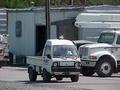
mini transportationby AllenComment by sher: Greetings from the Critique Club! :)
What a cute little truck! I love the contrast in the sizes of vehicles.
There are a couple of things I see here that are causing some problems. First...the photo has a snapshot quality to it. While that's not always a bad thing, the challenge is to make photos that don't really feel like snapshots. Second...the background of your photo has a lot going on in it and it is distracting from your subject.
I was thinking that another way this could be photographed is to have all the trucks lined up with this little guy at the end of the line. You would still be able to show the contrast of sizes and it would make the subject stand out more. It would also show some planning with regard to composition and therefore, less snapshot-ish.
Just a couple of suggestions you may want to think about. I hope they help.
Good luck in future challenges!
Sher :) |
| 05/09/2003 07:46:14 AM |
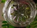
Glassby AllenComment by marbo: Poor focus, composition and you can`t even tell what it is. |
| 05/09/2003 04:44:34 AM |
|
| 05/08/2003 06:31:59 PM |
Glassby AllenComment by jaam: Very novel concept, let down by the following:
Seems to be a lot of noise (could have been prevented by using more light and a lower ISO). there is also very uneven lighting, far too much from the left, might have been better to have had your light from behind the fern.
The ashtray looks dirty, so if it had been poperly cleaned prior to the challenge it might have paid to have bought a new one which might have been a bit clearer.
Feel that the empty space on the left should have been filled with the fern to create a more symetric foto. Would also have been nice to see the colour of the flowers the whole way around the base of the ashtray. |
| 05/07/2003 07:36:48 PM |
Glassby AllenComment by autool: Youre idea was good but the overpowering light hurt you quite a lot. You might try putting a sheet or something over the windowor light source to break up the light so you don't get so much damaging glare. 4 |
| 05/07/2003 12:27:57 PM |
Glassby AllenComment by rickhd13: this is a bit too dark for my tastes, would like to have seen more of the detail |
| 05/07/2003 01:08:41 AM |
Glassby AllenComment by Pedro: not sure why you cropped the top of the candle out - it takes away some of the symmetry for me. a little grainy on the leaves as well - on purpose? |
| 05/01/2003 02:58:31 PM |
|
| 04/30/2003 08:25:28 PM |
mini transportationby AllenComment by frisca: bit grainy with too much of a "snapshot" feel to it. The elements in the background are huge and similar in colour and tone to the subject so are very distracting. |
| 04/29/2003 01:40:31 PM |
|
Home -
Challenges -
Community -
League -
Photos -
Cameras -
Lenses -
Learn -
Help -
Terms of Use -
Privacy -
Top ^
DPChallenge, and website content and design, Copyright © 2001-2026 Challenging Technologies, LLC.
All digital photo copyrights belong to the photographers and may not be used without permission.
Current Server Time: 07/16/2026 02:13:39 PM EDT.