| Image |
Comment |
| 05/22/2003 07:34:05 AM |
|
| 05/21/2003 11:09:24 PM |
Numbers?by thatguyComment by sotsot: If you manage to turn the white wording into greenish, the impression of this pic will totally changed. the color contrast of this pic is not strong enough. Can u imagine my words? lack of freaking feeling with this color contrast |
| 05/21/2003 01:56:04 PM |
|
| 05/21/2003 01:26:28 PM |
Numbers?by thatguyComment by zeuszen: Unless I've missed something in the code, the second dimension remains too subtle for consumption. :-) In this respect... very topical. |
| 05/21/2003 03:09:22 AM |
|
| 05/20/2003 03:14:07 PM |
|
| 05/18/2003 09:58:02 PM |
|
| 05/16/2003 03:34:07 PM |
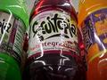
Got Fruitby thatguyComment by dadas115: I like the camera angle and the idea for this picture but something isn’t quite right. It just doesn’t look natural, maybe it is the white balance? I also don’t like the way the light is reflecting off the label of the middle bottle. I know the lighting is very harsh in those refrig’s and that aspect of this picture is more accurate but I find the bright speculars to be distracting. I think the shot was well composed though. I gave it a 5.
Greg
|
| 05/16/2003 02:40:46 PM |
|
| 05/16/2003 10:51:04 AM |
|
Home -
Challenges -
Community -
League -
Photos -
Cameras -
Lenses -
Learn -
Help -
Terms of Use -
Privacy -
Top ^
DPChallenge, and website content and design, Copyright © 2001-2026 Challenging Technologies, LLC.
All digital photo copyrights belong to the photographers and may not be used without permission.
Current Server Time: 07/15/2026 07:44:18 PM EDT.