| Image |
Comment |
| 09/11/2006 02:39:27 AM |
|
| 09/06/2006 02:17:37 PM |
|
| 09/06/2006 06:31:05 AM |
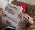
The Sunday Paperby kh82791Comment by quickpik: A really good idea for a photo, however the door is a little distracting and it would have been nicer to see an eye on the paper. |
| 09/06/2006 12:31:55 AM |
|
| 08/29/2006 09:33:44 AM |
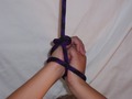
A Simple Ropeby kh82791Comment by Rae-Ann: Good Idea, but pay attention to your wrinkled background ,it becomes the focus of the picture. The centered composition doesn't make it sing for me...I was thinking some better, more dramatic lighting wouldn't have hurt... |
| 08/25/2006 12:55:25 PM |
A Simple Ropeby kh82791Comment by docurrie: Several things on this picture, first I would put the back drop farther away from the subject to let it be able to be out of focus, some lighting on the rope and hands would have helped to bring out some detail in the rope and I would have set this up or cropped it so none of the head was in the picture. |
| 08/25/2006 11:56:02 AM |
A Simple Ropeby kh82791Comment by JamesKW: More lighting or emphasis on the rope to bring out the details would have been a little better. |
| 08/24/2006 06:43:27 PM |
|
| 08/23/2006 07:54:23 PM |
A Simple Ropeby kh82791Comment by violinist123: Too close to the background so all the wrinkles in the fabric show. Time not spent pulling the background fabric taut to remove the large fold on the right. White as a background for this was a poor choice. Top of head sticking up at the bottom of the photo doesn't work. Composition could have better played up the triangular shape made of arms and robe but here the arms are sort of haphazardly arranged and the shot is off balance. Finally, looks like this was shot with a flash or some really harsh straight-on light making for some nasty shadows. |
| 08/23/2006 02:57:38 PM |
|
Home -
Challenges -
Community -
League -
Photos -
Cameras -
Lenses -
Learn -
Help -
Terms of Use -
Privacy -
Top ^
DPChallenge, and website content and design, Copyright © 2001-2026 Challenging Technologies, LLC.
All digital photo copyrights belong to the photographers and may not be used without permission.
Current Server Time: 07/15/2026 02:07:01 PM EDT.