| Image |
Comment |
| 06/24/2003 02:23:07 PM |
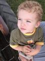
Conor.jpgby PedroComment by Crafty Sue: This is a good picture and a very cute little boy. Don't let the people who don't like kid shots stop you from pictures like this.
But then I am a Grandmother and love to take pictures of my Grandchildren.
Sue |
 Photographer found comment helpful. Photographer found comment helpful. |
| 06/24/2003 01:12:16 PM |
|
| 06/23/2003 12:23:02 AM |
|
| Photographer found comment helpful. |
| 06/22/2003 10:36:34 PM |
Solitary Treeby PedroComment by HBunch: Your border isn't equal all around. it's thinner at the top than on the other 3 sides. I like this shot, but seems to be some blotchyness in the sky. Colors are ok, nice off centered subject. Good juse of negative space. |
| Photographer found comment helpful. |
| 06/22/2003 08:29:37 PM |
|
| Photographer found comment helpful. |
| 06/22/2003 05:46:29 PM |
Solitary Treeby PedroComment by mariomel: i like it but wish the perspective was from just a bit lower. That way you would have seen the entire leafy part of the tree against the blue sky. |
| Photographer found comment helpful. |
| 06/22/2003 12:34:33 PM |
Solitary Treeby PedroComment by eloise: This image just floors me, for reasons I can't adequately describe. 10. I especially like how the canopy of the tree is resting on the horizon. |
| Photographer found comment helpful. |
| 06/22/2003 11:43:46 AM |
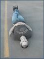
The Devil in Bluejeansby PedroComment by Journey: I SWEAR leaving a nice comment with this picture and a score of 7 Wed night but now that i revisit this challenge it seems unmarked. This is just another glitsch at dpc. Anyway, what i recall having said is that i took your picture into PS (because i was curious :) and did a flip vertical and it gives a very interesting effect. Try it and you'll see! I like the originality of the layout, so to speak. Why not just put yourself in the gutter? :) It's a fun image. It has a lot of 'presence'. And i like images that are simple and uncluttered. You could have done a little more with the yellow line; it just sits there. For starters, you could have cropped the bottom so that the yellow line runs the entirety of the image. In fact, you could have cropped more off the top and the bottom. The guy in the image looks like a 10 to me but since i'm supposed to vote on photog merits only, i give this image a 7. |
| Photographer found comment helpful. |
| 06/22/2003 11:13:57 AM |
The Devil in Bluejeansby PedroComment by juliaperson: Its an interesting angle, and certainly more creative than most of the entries. I like the slightly washed out colors, the idea that the image and the title together sugest. The only thing that bothers me is the street line. I feel like it should be parallel with the edge of the photo, although maybe thats hard to do from your angle. Anyway, good work, I like it a lot and you get a 9. |
| Photographer found comment helpful. |
| 06/21/2003 11:56:45 AM |
|
| Photographer found comment helpful. |
Home -
Challenges -
Community -
League -
Photos -
Cameras -
Lenses -
Learn -
Help -
Terms of Use -
Privacy -
Top ^
DPChallenge, and website content and design, Copyright © 2001-2026 Challenging Technologies, LLC.
All digital photo copyrights belong to the photographers and may not be used without permission.
Current Server Time: 06/21/2026 11:38:54 AM EDT.