DPChallenge: A Digital Photography Contest You are not logged in. (log in or register
 
Browse Settings
Currently viewing:
Registered UserMusicman

Show comments:

Per page:

Order:

Comments:


Comments Received by Musicman
Pages:   ... ...
Showing 211 - 220 of ~313
Image Comment
United
05/12/2003 01:54:50 PM
United
by Musicman

Comment by lumbardh:
Out of focus
Photographer found comment helpful.
Performance
05/12/2003 08:48:53 AM
Performance
by Musicman

Comment by tyrkinn:
Too dark, the red is also not the biggest point...
Photographer found comment helpful.
United
05/11/2003 10:20:18 PM
United
by Musicman

Comment by David Ey:
ankles are much too thin
Challenge Transporter
05/11/2003 11:01:47 AM
Challenge Transporter
by Musicman

Comment by autool:
Critique Club Critique

Title: Challenge Transporter, By Musicman

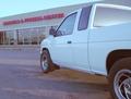
Composition: I find it difficult to define exactly what you had in mind here. Generally the photographer tries to lead the viewer to the main subject through the use of subject placement, lines found in and or around the subject, lighting techniques, and other conveyance that he/she can imagine. In your picture, the truck is headed directly at a building. The lines of the side of the truck lead me to the building. Your title indicate (kind of) that the truck is the subject, but it doesn't hold my attention when its line lead me away to the fitness center.

Technical: You shot the dark side of the truck where you would have a need for longer exposure, which may have required the use of a tripod to get a sharp image. Both focus, and exposure have a direct effect on the sharpness of the image. If it is under exposed it will become grainy and fuzzy, and with focus it will be blurry if not correct. I think your picture shows a little of each.

Challenge: With challenges so vague it was not difficult to meet the challenge this time, and you have done that.


Suggestions: To improve you abilities think about what you are showing the viewers, and what the effect will be on them. Use the basic rules of composition, exposure and lighting, all of which there are excellent tutorials on at the DPChallenge site. Any number of people will testify that the site and its members have helped them improve their skills, of which I am no exception. I rated your picture a 5 during the challenge, which was a smidgen above the masses, mainly because you got out there and took a picture that wasn't offensive, and met the challenge.

Keep shooting and have fun!

Dick

Disclaimer:
Bear in mind that I am here to learn, just as many others and any comments that I have made are not intended to be offensive in any way, and are only constructive criticisms. If you wish to comment or discuss this critique please feel free to do so at any time.
Thank you,
Dick Pattee (Autool)
Autool@attbi.com
United
05/10/2003 02:06:00 PM
United
by Musicman

Comment by carolee:
Looks blurry to me, and I'd crop either closer or farther, depending on the mood you're trying to create.
Photographer found comment helpful.
United
05/10/2003 04:53:16 AM
United
by Musicman

Comment by chickadee:
I think I would have chosen a different colour in the backgroud (the liquid blends too well). Perhaps the unfocused approach would have worked better if the shot wasn't so grainy, and the lighting was a softer and more ambiant.
Photographer found comment helpful.
United
05/09/2003 10:56:14 AM
United
by Musicman

Comment by jdavis:
Blurry & a bit dark.
Photographer found comment helpful.
United
05/09/2003 06:51:10 AM
United
by Musicman

Comment by kiwiness:
How did you get those glasses to balance like that? Did you put something under the bottoms to support them? What a good idea I like it, if only it were a little sharper it would be a top shot.
Photographer found comment helpful.
United
05/08/2003 07:03:18 PM
United
by Musicman

Comment by Lustre:
I like the balance and composition but the low lighting makes the image dull and soft. Also, there is some reflection in the right glass - it's very difficult to photograph well.
Photographer found comment helpful.
Challenge Transporter
05/08/2003 12:15:39 PM
Challenge Transporter
by Musicman

Comment by wewillexplore:
I know you want your $ worth of feedback, so let me give you .02 :)

This shot looks like it's a tad bit blurry from handholding. With this lowlight shot (perhaps the wrong whitebalance giving the blue cast?) - you would want to use a tripod. I know for a fact that this cam sets and tells you your shutter speed, so look at it. If it's 1/30 or more (closer to 1 full second) then you will want to use a tripod - it's not possible to handhold 1/30 with this kind of lighting. You will ALWAYS get blur.

Second - open your image in your editing program (Photoshop, PSP, PS Elements, PhotoSuite, etc) and adjust the colors and saturation - try to make those reds appear red and the blacks appear black. It takes awhile to get a fine touch, but you'll get it. (make sure you work in a copy, not the original - so save it twice)

Third - what's the idea behind adding the building? To show where the truck is? What's the transportation idea? Setzler taught me a valuable question in photography - WHY? Why is it here? Why this angle? Why this lighting? Why these settings? Why the building? Why...all of it. Why crop off part of the truck?

If you can answer EVERY why for your picture, you've gotten a better picture.
Pages:   ... ...
Showing 211 - 220 of ~313


Home - Challenges - Community - League - Photos - Cameras - Lenses - Learn - Help - Terms of Use - Privacy - Top ^
DPChallenge, and website content and design, Copyright © 2001-2025 Challenging Technologies, LLC.
All digital photo copyrights belong to the photographers and may not be used without permission.
Current Server Time: 08/01/2025 11:30:01 AM EDT.