DPChallenge: A Digital Photography Contest You are not logged in. (log in or register
 
Browse Settings
Currently viewing:
Registered UserMusicman

Show comments:

Per page:

Order:

Comments:


Comments Received by Musicman
Pages:   ... ...
Showing 161 - 170 of ~313
Image Comment
Dine -In
06/16/2003 01:58:08 AM
Dine -In
by Musicman

Comment by dasser:
I like but are we allowed to selectively desaturate? Great idea all the same and an 8 for me.
Photographer found comment helpful.
I'm watching you
05/29/2003 11:08:35 PM
I'm watching you
by Musicman

Comment by HBunch:
*Critique Club*
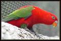
The first thing I notice here is that the bark is really really in focus and sharp. Right around the feet of the bird. See how that seems much more strong than his eye? I would prefer this the other way around. His eye really is an eye catcher. The title is perfect, and That is exactly what I want to look at here.
However, with the bark being so clear, I'm sitting here admiring the detail you captured in the bark, and ignoring his eye. Also, there is a bit of a glare in his eye, which is really too strong to be considered an effective catch light.
Personally, I think you did a good job of getting the fence out of the way. The blurred background works very nicely and is effective in reducing distractions on the bird.
Lighting appears to have been just great. Conditions look like they were working with you on this day. With the tiny exception of the glare in the eye, I think that the lighting creates no distractions. No bright light, no annoying shadows. Nothing.
The angle and framing/cropping are ok. I think that I like having him bent over like this. It makes for a 'different' kind of view than we usually see with the bird 'sitting pretty'. I do think though that maybe he could have a little more room to breathe on the right side. I think this would just be a suggestion that I would have to SEE in order to say if I really liked it or not. He himself is so spread out, that it makes for a spread out shot to begin with. Making the shot even bigger could actually damage the shot and not enhance it. So take that suggestion as just an experiment rather than a dead set 'must have'.
Overall, I think he's really pretty, and it's well done. A bit more focus, and I think this would have topped even better.
Great colors.
~Heather~
Photographer found comment helpful.
Hello there
05/28/2003 11:56:30 PM
Hello there
by Musicman

Comment by DennisF:
Cool ears. A good cow shot. The tones were a good choice. The focus is a too soft for me on this shot and the crop a little tight.
Photographer found comment helpful.
Hello there
05/28/2003 02:12:50 PM
Hello there
by Musicman

Comment by StevePax:
I need just a little more at the bottom to complete the face.
Photographer found comment helpful.
Hello there
05/27/2003 09:50:48 PM
Hello there
by Musicman

Comment by David Ey:
a bit lacking in depth...but nice shot
Photographer found comment helpful.
Hello there
05/27/2003 09:42:05 AM
Hello there
by Musicman

Comment by qachyk:
I was trying to think of something clever to say involving bulls, but I'm afraid it's too early in the morning. Not a topic that grabs me -- being from the Midwest I've seen far too many of these -- but I do like the up-close-and-personal shot of it and the black and white colouring suits it well.
Photographer found comment helpful.
Hello there
05/27/2003 12:15:52 AM
Hello there
by Musicman

Comment by connie:
Great shot!
Photographer found comment helpful.
Hello there
05/26/2003 11:22:22 AM
Hello there
by Musicman

Comment by RiderGal:
This photo seems fuzzy to me. I think it actually would have been more effectual in color, with the green grass behind the animal. Personally I don't care for it. Also the cow somehow looks a little tilted. Sorry but I don't think that you attained what you were going for.
Photographer found comment helpful.
The color purple
05/26/2003 11:17:05 AM
The color purple
by Musicman

Comment by HBunch:
*Critique Club*
Wow, does this really jump right out of the screen!
The angle and framing/cropping on this is just perfect. I think that having the subject centered here really works for this shot. Some kind of side angle just wouldn't produce this kind of depth.
Focus and clarity are really good as well. We can see all kinds of detail in flowers, especially in the very center, where the fuzzy little things are.
The lighting looks great to me as well. As does the DOF. You have blurred the background nicely, and I find no distracting elements there. The purple on green really looks great.
Definately fits the challenge, and the colors stand out very nicely.
I don't really think there is anything I'd like to see differently here. I can't really make any suggestions on improvement. Just a really great shot.
~Heather~
I'm watching you
05/25/2003 09:34:48 PM
I'm watching you
by Musicman

Comment by Gallatin:
Nice shot
Photographer found comment helpful.
Pages:   ... ...
Showing 161 - 170 of ~313


Home - Challenges - Community - League - Photos - Cameras - Lenses - Learn - Help - Terms of Use - Privacy - Top ^
DPChallenge, and website content and design, Copyright © 2001-2025 Challenging Technologies, LLC.
All digital photo copyrights belong to the photographers and may not be used without permission.
Current Server Time: 08/02/2025 12:12:00 AM EDT.