| Image |
Comment |
| 07/31/2003 07:56:11 AM |
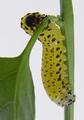
Garden Visitorby MusicmanComment by BobsterLobster: A little too much glare for my liking, other than that this is superb. Very simple and effective composition. Great background. Lovely idea. Perhaps a tad more saturation on green might have helped. 9 |
 Photographer found comment helpful. Photographer found comment helpful. |
| 07/30/2003 09:33:15 PM |
|
| Photographer found comment helpful. |
| 07/30/2003 05:43:28 PM |
Garden Visitorby MusicmanComment by clues56: GOOD!!! It could be just a tiny bit more sharp, and it would be in first place.
Take a look at the snail picture, and imagine if this were as sharp how great it would be. |
| Photographer found comment helpful. |
| 07/30/2003 12:24:14 PM |
|
| Photographer found comment helpful. |
| 07/30/2003 10:00:38 AM |
|
| Photographer found comment helpful. |
| 07/26/2003 02:35:28 PM |
|
| Photographer found comment helpful. |
| 07/26/2003 12:03:05 PM |
|
| Photographer found comment helpful. |
| 07/24/2003 02:23:16 AM |
|
| Photographer found comment helpful. |
| 07/23/2003 10:45:52 PM |
Freeway Artby MusicmanComment by jas0420: Loads of contrast here... Really like this shot! The only thing I find a little distracting is the greenish tint in the upper portion of the shot, especially over on the left side. Makes it look like it was desaturated, but a small range of colors was missed. Otherwise, really nice though. Good job! |
| Photographer found comment helpful. |
| 07/23/2003 04:38:12 PM |
|
Home -
Challenges -
Community -
League -
Photos -
Cameras -
Lenses -
Learn -
Help -
Terms of Use -
Privacy -
Top ^
DPChallenge, and website content and design, Copyright © 2001-2026 Challenging Technologies, LLC.
All digital photo copyrights belong to the photographers and may not be used without permission.
Current Server Time: 07/15/2026 07:16:05 PM EDT.