| Image |
Comment |
| 06/10/2003 11:36:48 PM |
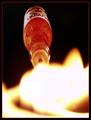
Liquid Fireby JPRComment by frisca: I would have preferred a wider angle to see the liquid and its bottle a little more. :) |
 Photographer found comment helpful. Photographer found comment helpful. |
| 06/10/2003 06:18:15 PM |
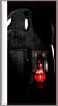
Logitech Abstractby JPRComment by qachyk: I neither care for nor understand the point of the big white border line to the left. It's just distracting to me.
In terms of lighting I like this. Otherwise, well, it's the bottom of a mouse, and it doesn't terribly interest me, though it meets the topic fine. |
| Photographer found comment helpful. |
| 06/10/2003 12:22:00 PM |
Logitech Abstractby JPRComment by orussell: In all fairness let me see if I can do this constructively. In my opinion, the subject matter, the underside of a mouse is not overly interesting. Maybe if you had cropped in closer on the red portion of the image, provided it was feasible and without too much pixelation. That part of the image is actually more interesting than the rest; it actually looks like a cyclops - call me crazy. My suggestion I think would really highlight the abstract nature that you were trying to convey much more. Also I think the border is a little overdone. I do however like the red pinstripe with the grey as you have it on the right side. I'd loose the white. Also maybe if you had tried cleaning up the image with unsharp mask or Neat Image. Hope this is a fair assesement. Cheers. |
| Photographer found comment helpful. |
| 06/09/2003 08:55:28 PM |
|
| 06/09/2003 07:00:17 PM |
|
| Photographer found comment helpful. |
| 06/09/2003 05:01:22 PM |
|
| Photographer found comment helpful. |
| 06/09/2003 12:54:00 PM |
Logitech Abstractby JPRComment by Mitonski: Nice shot, interesting border. A bit more light from the optical would have got more from me, but an interesting shot none the less. |
| Photographer found comment helpful. |
| 06/09/2003 09:53:34 AM |
|
| Photographer found comment helpful. |
| 06/09/2003 04:22:17 AM |
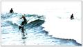
Surfby JPRComment by JPR: Thanks for the inspiration mav.
Thanks to everyone who gave me positive (and negative) feedback on the high-key exposure. I'm happy with it despite the score I got and I'm glad others liked it as well. To explain a bit why I used it: I was doing logos for a surfshop so I wanted as few colors as possible as well as a background that cut into it naturally from the light. Also, the effect gave the waves much more definition. I edited out the other surfers floating in another version, but I couldn't do that for the challenge. I think it's funny that some people commented that it was very good for "sound" while others said that it didn't meet the challenge. Oh well. |
| 06/09/2003 12:36:11 AM |
Surfby JPRComment by wewillexplore: D'oh! Not gonna chase me off our cam page like that! C'mon now... :) *inspirational speech here*
Our cam is perfectly capable of kicking some major tail. NOW GET ON IT. :)
hehe
*end inspirational speech*
Good luck next week! |
| Photographer found comment helpful. |
Home -
Challenges -
Community -
League -
Photos -
Cameras -
Lenses -
Learn -
Help -
Terms of Use -
Privacy -
Top ^
DPChallenge, and website content and design, Copyright © 2001-2026 Challenging Technologies, LLC.
All digital photo copyrights belong to the photographers and may not be used without permission.
Current Server Time: 07/28/2026 09:21:32 AM EDT.