| Image |
Comment |
| 11/16/2003 03:07:53 PM |
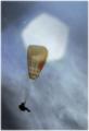
Stranger to the Groundby JPRComment by piwoguy: I really like the dream-like quality of this photo, although that speck in the upper left is a little distracting. Still very effective techniques here, nonetheless. The scores are close for me, but I might as well boost one above the rest; this is my top score for the week. |
| 11/16/2003 11:42:20 AM |
|
| 11/16/2003 07:20:27 AM |
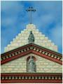
Missionby JPRComment by KevinRiggs: Focus is soft towards the bottom of the image and the more colorful building areas look grainy. Great cropping (or composition) and it looks like you had wonderful weather for this shot. |
| 11/15/2003 07:41:51 PM |
Missionby JPRComment by Neuferland: This shot is well cropped and set up very well. The lighting and contrast leaves me a bit wanting though. The shadows on below the lower ledge and the upper lerft ledge is really noticable and hurts this shot a bit to me. Perhaps if you had gone black and white or duotone to play on those shadows? A 7, up from a 6 |
| 11/15/2003 01:03:59 PM |
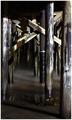
Under the Bridge to Has Been and Alwaysby JPRComment by jmsetzler: Greetings from the Critique Club :)
Hi Jason...
Your photo meets the challenge well in my opinion. The repeating patterns of the pilings seem to have no end. I particularly like the bit of fog that is present on the surface of the water. That adds an interesting element of mystery to the image. In general, I enjoy photos where the 'gemoetries' make up the strength of the image.
My interest in this particular photo fades away rather quickly because of the lighting. This scene has a lot of contrast and no primary point of interest. It is, entirely, a shapes and patterns theme more than anything else. I think there may be a strong photo waiting for you in this scene if you can find it :) If I may, I would suggest some rotation of the view to strengthen the diagonal theme as well. |
| 11/15/2003 06:16:18 AM |
Missionby JPRComment by LindaLee: A lovely and interesting architectural shot, your composition is perfect for the lines and angles, and I just love the colors. The only "nitpick" I have is that I would like to have seen a little more lighting on the dentil molding to give the shot a little more depth. |
| 11/14/2003 02:41:24 PM |
|
| 11/14/2003 11:27:32 AM |
|
| 11/14/2003 09:05:51 AM |
Missionby JPRComment by kiwiness: A very clean and symmetrical image. By the looks of this building it is not that old. The edges of the building are very sharp and outine prominently against the background sky. |
| 11/14/2003 12:46:33 AM |
Missionby JPRComment by Firstrich1: I would have to venture a guess you were kind enough to have left a comment on my image given your statement that yours was much the same as the one I produced. very well done! subtle colors nice perspective. I like the soft clouds in the sky as well.
Good Luck
Richard |
Home -
Challenges -
Community -
League -
Photos -
Cameras -
Lenses -
Learn -
Help -
Terms of Use -
Privacy -
Top ^
DPChallenge, and website content and design, Copyright © 2001-2026 Challenging Technologies, LLC.
All digital photo copyrights belong to the photographers and may not be used without permission.
Current Server Time: 06/03/2026 10:39:01 PM EDT.