| Image |
Comment |
| 10/08/2009 12:11:04 PM |
Regalby NikonJebComment by Denise: wow, beautiful pet portrait, love how he/she seems to fade into the background |
 Photographer found comment helpful. Photographer found comment helpful. |
| 10/08/2009 08:55:43 AM |
|
| Photographer found comment helpful. |
| 10/08/2009 03:39:20 AM |
|
| Photographer found comment helpful. |
| 10/08/2009 03:21:42 AM |
|
| Photographer found comment helpful. |
| 10/08/2009 12:06:12 AM |
|
| Photographer found comment helpful. |
| 10/07/2009 11:44:15 PM |
Regalby NikonJebComment by Maggye: That's a really lovely portrait, the pp makes that beautiful kitty stand out! |
| Photographer found comment helpful. |
| 10/07/2009 09:58:58 PM |
|
| Photographer found comment helpful. |
| 10/07/2009 04:58:01 PM |
|
| Photographer found comment helpful. |
| 10/07/2009 03:33:32 PM |
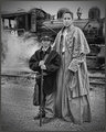
Off to War.....by NikonJebComment by patches: Love the expression on the woman's face - wish the rifle was turned the other way so it didn't look so much like a stick. Makes one wonder what the future is in this story. |
| Photographer found comment helpful. |
| 10/07/2009 01:45:06 PM |
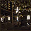
The Carriage in the Loft...by NikonJebComment by EstimatedEyes: Nice lighting, reasonable subject for the challenge, and a neat peek inside a barn. Individually nice elements, but the total is a bit lacking in impact for me so it scores no higher than a ... 6 |
| Photographer found comment helpful. |
Home -
Challenges -
Community -
League -
Photos -
Cameras -
Lenses -
Learn -
Help -
Terms of Use -
Privacy -
Top ^
DPChallenge, and website content and design, Copyright © 2001-2026 Challenging Technologies, LLC.
All digital photo copyrights belong to the photographers and may not be used without permission.
Current Server Time: 05/09/2026 07:17:39 AM EDT.