| Image |
Comment |
| 11/16/2006 01:50:33 PM |
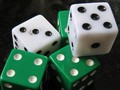
Yahtzee Spotsby HoochieComment by DrAchoo: Meets the challenge well, but isn't too exciting. Pictures of trinkets or doodads just aren't too compelling. 4 |
 Photographer found comment helpful. Photographer found comment helpful. |
| 11/16/2006 09:57:15 AM |
Yahtzee Spotsby HoochieComment by glad2badad: A little too close up on this I think. Would also help if the pieces (dice and background) were clean. Do what you can physically to control the environment, then use despeckle (or similar noise reduction) to minimize some of the other smaller specks. A true black background would be helpful here (pick up a black poster board for a couple bucks at local art store). In this case a minor adjustment to levels and contrast might have worked. All of the above is JMO of course. Best of luck to you in the challenge. |
| Photographer found comment helpful. |
| 11/15/2006 06:05:37 PM |
Yahtzee Spotsby HoochieComment by MaryO: They look well-used ;-) I kind of like the off-balance composition; makes it feel like the die on top is going to fall off any second. A little soft but I think that works with the other signs of age on the dice. |
| Photographer found comment helpful. |
| 11/11/2006 08:54:51 PM |
|
| Photographer found comment helpful. |
| 11/11/2006 08:34:20 PM |
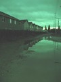
Urban Reflectionsby HoochieComment by Melethia: I rather like this. The first impression is "lacks contrast"... but then you think about it for a minute, and the urban landscape pretty much lacks contrast so this picture is very much reflective of it's subject. In the DPC world of thing, I'll bet you're getting comments that it lacks contrast. |
| Photographer found comment helpful. |
| 11/11/2006 12:53:15 AM |
|
| Photographer found comment helpful. |
| 11/10/2006 04:20:51 PM |
|
| Photographer found comment helpful. |
| 11/10/2006 03:27:13 PM |
|
| Photographer found comment helpful. |
| 11/09/2006 01:33:50 PM |
Urban Reflectionsby HoochieComment by faery: There is a brooding, sombre feeling in this. I don't personally like the green hue saturation. Interesting composition though. |
| Photographer found comment helpful. |
| 11/09/2006 12:22:30 PM |
|
| Photographer found comment helpful. |
Home -
Challenges -
Community -
League -
Photos -
Cameras -
Lenses -
Learn -
Help -
Terms of Use -
Privacy -
Top ^
DPChallenge, and website content and design, Copyright © 2001-2026 Challenging Technologies, LLC.
All digital photo copyrights belong to the photographers and may not be used without permission.
Current Server Time: 07/16/2026 12:15:58 AM EDT.