| Image |
Comment |
| 03/11/2007 03:16:05 PM |
Red Inkby HaneckComment by PDF: doesn't seem enough ink to be a D. I get that much red in my papers when it's a B!... anyway... i like the pic. |
 Photographer found comment helpful. Photographer found comment helpful. |
| 03/11/2007 08:40:08 AM |
Red Inkby HaneckComment by Jedusi: nice idea and I like the lighting on the paper. My only thought is whether it could have lost an inch of the top? |
| Photographer found comment helpful. |
| 03/09/2007 11:42:07 AM |
Red Inkby HaneckComment by cogerox: What a great concept and really well executed. I think you've got a little too much negative space at the top, but otherwise well composed. |
| Photographer found comment helpful. |
| 03/09/2007 06:29:48 AM |
Red Inkby HaneckComment by rosiehall: this shot look a little washed out and quite grainy sorry, nice idea though |
| Photographer found comment helpful. |
| 03/07/2007 09:22:24 AM |
|
| Photographer found comment helpful. |
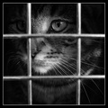
| 03/06/2007 05:10:22 PM |
I hate cages.by HaneckComment by SteveJ: A comment from the Critique Club:
First, the technical side. Centralised shots are often panned but this works well. The DOF is spot on with the bars of the cage nicely out of focus and the cat sharp on the eye. B&W works well with this, but I think the border is a little distracting.
Composition: Centre subject has to be strong, and this is, the eye is drawn to the eye of the cat which seems to state imprisonment. I am not a great lover of Borders and would prefer to see this shot without a border.
Overall: I didn't really like this at first glance, it was just another pet closeup. Then I started looking deeper and there is a sadness reflected by the B&W. Maybe a tad oversharpened, but a powerful image that is reflected in the score. A well constructed photo that I fear has been down voted cos it is B&W and of a pet. A good shot and worthy of its position. |
| Photographer found comment helpful. |
| 03/02/2007 08:00:43 AM |
|
| Photographer found comment helpful. |
| 03/01/2007 05:27:20 PM |
C a n d l e l i g h tby HaneckComment by Rino63: I think that here you lose a chance for a very great shot. the photograph is good, good the tones and good lights. I think that you need some words on the sheet for a better scene. 8 |
| Photographer found comment helpful. |
| 02/28/2007 10:01:01 PM |
|
| Photographer found comment helpful. |
| 02/28/2007 02:48:07 PM |
C a n d l e l i g h tby HaneckComment by h2: classic image, a tad too bright overall - wished, the background was pure black -, otherwise very well executed. |
| Photographer found comment helpful. |
Home -
Challenges -
Community -
League -
Photos -
Cameras -
Lenses -
Learn -
Help -
Terms of Use -
Privacy -
Top ^
DPChallenge, and website content and design, Copyright © 2001-2026 Challenging Technologies, LLC.
All digital photo copyrights belong to the photographers and may not be used without permission.
Current Server Time: 07/16/2026 12:01:15 AM EDT.