| Image |
Comment |
| 08/21/2007 09:05:34 AM |
|
 Photographer found comment helpful. Photographer found comment helpful. |
| 08/20/2007 09:50:07 AM |
1932 Pegasusby bergiekatComment by rossbilly: Great job on this Kat - i KNEW it would look terrific when we chimped it! This one hallway could have kept me occupied for a couple hours, just trying the various exposures (and the staircase made me want to order a wide angle lens!)
Yours definitely turned out better than mine. ;)
|
| Photographer found comment helpful. |
| 08/20/2007 07:49:30 AM |
|
| Photographer found comment helpful. |
| 08/19/2007 07:26:48 PM |
Pimpin'by bergiekatComment by rossbilly: Terrific! That was the most fun I'd had in a while - and it was worth the humiliation! This place had an amazingly fun crew, great band, cold beer, funny guests, and terrific food!
Oh, and you wouldn't BELIEVE what else I got in Dallas for only 5 bucks! ;) |
| Photographer found comment helpful. |
| 08/09/2007 04:23:29 AM |
|
| Photographer found comment helpful. |
| 08/05/2007 10:20:39 PM |
|
| Photographer found comment helpful. |
| 07/27/2007 01:02:52 PM |
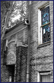
Beauty in Decayby bergiekatComment by HeiSch: good taste in the seletive desat. nicely done. My first thought was that the photo need straightening until I noticed that this might be impossible to do. A much tighter crop (eliminate the bottom part just above the door) could help focusing on your subject - the window.
Just the opposite on the crop - too tight on the upper corner of the window. The crop would bring the format more into the typical 3:4 ratio.
The tree trunk then becomes a matter of preference. It could set some bounderies for the open space on the left or it could be seen as distracting. Either way you're right or your wrong.
A little more work on curves and contrast would bring out the texture of the weathered bricks. May be you could think of saturating them just enough to guess their color? Just a hint of saturation. I guess they're red - so it would be very nice contrast to the blue window. Just some ideas...
I also guess you decided to use the wide range of your lens?
If you have the chance and go back, try the tele range of your lens and move further away. This will reduce the distortion of the lines of the building.
My final thought: clone out the power line :)
Message edited by author 2007-07-27 13:25:40. |
| Photographer found comment helpful. |
| 07/25/2007 03:24:42 AM |
Beauty in Decayby bergiekatComment by h2: Selective desat works well here, black/white tones are good. Had tried to correct the perspective. The blue border doesn't add to the picture IMO. |
| Photographer found comment helpful. |
| 07/19/2007 11:02:14 PM |
|
| Photographer found comment helpful. |
| 07/19/2007 11:00:55 PM |
|
| Photographer found comment helpful. |
Home -
Challenges -
Community -
League -
Photos -
Cameras -
Lenses -
Learn -
Help -
Terms of Use -
Privacy -
Top ^
DPChallenge, and website content and design, Copyright © 2001-2026 Challenging Technologies, LLC.
All digital photo copyrights belong to the photographers and may not be used without permission.
Current Server Time: 07/17/2026 02:56:36 AM EDT.