| Image |
Comment |
| 05/01/2003 12:21:17 PM |
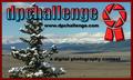
Photo Stickerby jimsappComment by Kavey: Nice photo but it\'s choice baffles me - other than that it\'s a nice pic it doesn\'t convey digital photography or contest to me.
Not keen on bevelled and gradiated treatment of text/ logo.
Not a winner for me, sorry!
Kind Regards
4, Kavey |
| 05/01/2003 11:34:05 AM |
Sticker DPCPby jimsappComment by Konador: The first thing that hits me when looking at this is that the images aren't centered. The second thing is the colouring in the 'dpchallenge'. I've never been a fan of mixing yellow and blue, which is just a personal preference. I think the bevel on the 'Prints!' looks pretty good, but on dpchallenge it just doesnt work as well. I think for bevel to look good it needs the right font. |
| 05/01/2003 11:31:53 AM |
|
| 05/01/2003 08:54:29 AM |
|
| 05/01/2003 08:45:30 AM |
|
| 04/30/2003 08:42:09 PM |
|
| 04/30/2003 02:35:19 PM |
|
| 04/30/2003 11:49:24 AM |
|
| 04/30/2003 11:45:49 AM |
|
| 04/29/2003 11:34:22 PM |
|
Home -
Challenges -
Community -
League -
Photos -
Cameras -
Lenses -
Learn -
Help -
Terms of Use -
Privacy -
Top ^
DPChallenge, and website content and design, Copyright © 2001-2026 Challenging Technologies, LLC.
All digital photo copyrights belong to the photographers and may not be used without permission.
Current Server Time: 07/18/2026 06:44:06 AM EDT.