| Image |
Comment |
| 03/11/2011 01:44:57 AM |
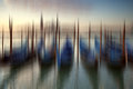
303_0818by salmiakkiComment by MargaretNet: First Impressions: Beautiful colors - blues, greens, yellows, muted oranges, reds. I like the composition with the dominant vertical lines. The effect is very dreamy of living on the water.
Technique: PP in Photoshop
Suggestions: it should be the result that matters not the technique
Overall a great example of photo impressionist style. |
 Photographer found comment helpful. Photographer found comment helpful. |
| 03/11/2011 12:58:21 AM |
|
| Photographer found comment helpful. |
| 03/10/2011 08:17:01 PM |
303_0818by salmiakkiComment by Neat: I never lose interest at looking at these gondolas, they are stunning. |
| Photographer found comment helpful. |
| 03/10/2011 06:41:23 PM |
303_0818by salmiakkiComment by tnun: I sort of know what you mean; nonetheless this is a very pleasing abstraction. |
| Photographer found comment helpful. |
| 03/10/2011 06:27:34 PM |
303_0818by salmiakkiComment by pixelpig: The original is beautifiul (I remember it from the FS) & this is too. You might have extra 'illicit' fun by combining them. IMO less detai leaves more room for my imagination--I like both but this one is #1 for me. Your PP does not cominate the image, but adds to it. Well done! |
| Photographer found comment helpful. |
| 03/10/2011 06:21:07 PM |
303_0818by salmiakkiComment by jomari: To me, it's all about the image. I don't care how you create it. This is lovely. |
| Photographer found comment helpful. |
| 03/10/2011 05:33:58 PM |
303_0818by salmiakkiComment by tph1: Just a wonderful image. Sunset, water, boats... all things that appeal to me. And presented here in a fashion that inspires a daydream. Very nice! |
| Photographer found comment helpful. |
| 03/10/2011 03:19:38 PM |
303_0818by salmiakkiComment by Marjo: No "sadly" needed. The outcome is awesome. I wish I could process like this. It's perfect. |
| Photographer found comment helpful. |
| 03/10/2011 03:02:22 PM |
303_0818by salmiakkiComment by ursula: I don't consider it cheating one bit, unless you're trying to pass it off as in camera when it really isn't. To me it's the final product that counts, and how you got there is important only when there are requirements to how to get there (as in the rules for DPC-Challenges). I think for myself, what I go by is, if the postwork is so apparent that it "takes over", then it is too much (regardless of whether it is colour correction, HDRing to death, or adding blur). In this case, the post work is quite convincing, and looks very good. It makes for an interesting to look at graphic. So, just enjoy it!
|
| Photographer found comment helpful. |
| 03/10/2011 02:18:34 PM |
|
| Photographer found comment helpful. |
Home -
Challenges -
Community -
League -
Photos -
Cameras -
Lenses -
Learn -
Help -
Terms of Use -
Privacy -
Top ^
DPChallenge, and website content and design, Copyright © 2001-2026 Challenging Technologies, LLC.
All digital photo copyrights belong to the photographers and may not be used without permission.
Current Server Time: 06/25/2026 10:14:03 PM EDT.