| Image |
Comment |
| 06/18/2003 01:48:46 AM |
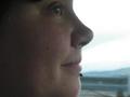
angby anggComment by Firstrich1: I see the rule of thirds. Black and White would ad nice contrast. |
 Photographer found comment helpful. Photographer found comment helpful. |
| 06/18/2003 12:59:32 AM |
angby anggComment by Gracious: Too close and lacking clarity. Nice smile though. |
| Photographer found comment helpful. |
| 06/18/2003 12:33:36 AM |
angby anggComment by Geocide: I would really like to see you less soft in the image(focus). The resolution of your camera is working against you, so be sure to make sure the focus is nice and tight. Otherwise, this image is nice. |
| Photographer found comment helpful. |
| 06/16/2003 03:55:30 PM |
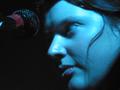
Rachelleby anggComment by macox: well it's off center I guess but kinda out of focus and why's it so blue?? |
| Photographer found comment helpful. |
| 06/16/2003 03:53:25 PM |
Rachelleby anggComment by STEINR: Rachelle seems a little blue these days. is that a micropone in the upper left hand corner? |
| Photographer found comment helpful. |
| 06/16/2003 03:43:48 PM |
Rachelleby anggComment by FranziskaLang: You meet the challenge here. I like that you haven't just placed your subject off-center, but added something in the remaining space that balances it and gives it context. Now, I'm assuming you took this at a concert, so you didn't have control over the lighting or the angle, and I know concert photography is hard (at least I pretty much consistently fail to get any decent pix, but that might just be that I'm not good at concert photography :-P ). Anyhow, there are a number of things that don't appeal to me personally: Rachelle does not seem to be quite in focus, the mike seems to be pointing at her forehead rather than her mouth, the bluish light giving her the bluish skin tone and lastly the fact that she is looking away and there's a shadow on her eye so it almost seems like there's no iris. I'm sorry I don't like your photo much, I'm sure part of it is just a matter of taste and others will appreciate the blue tint etc. I hope I pointed out some constructive things to look out for anyhow. |
| Photographer found comment helpful. |
| 06/16/2003 10:54:29 AM |
Rachelleby anggComment by alanfreed: Interesting shot, although I'm not quite sure how to feel about it. I think I might have liked it better if she had been singing at the time. |
| Photographer found comment helpful. |
| 06/16/2003 05:13:54 AM |
|
| Photographer found comment helpful. |
| 02/21/2003 08:36:16 PM |
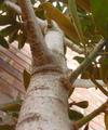
This Could Take All Day...Up Ya Go!by anggComment by byetko: Greetings from the critique club.
Composition: This is a very centered photo but I think it works in this case. I think if you removed the two leaves near the top center it would have shown more of the tree and more importantly the perspective of the tree. The brick background is a little distracting but you might not have had any other choice.
Technical: The bottom of the tree seems out of focus. Using a wider depth of field would have fixed that. Also the colors seem a little drab. Maybe in your photo editor you could have bumped up the contrast or levels a bit.
Overall: This is a good perspective shot and with a little pre-shot grooming of the tree and a little photo editing would have helped place this shot higher. |
| 02/21/2003 04:10:31 PM |
Frozen As Stoneby anggComment by karmat: CRITIQUE CLUB CRITIQUE
by karmat
COMPOSITION
Though your shot is a nice one of plants, I have a hard time finding a point of focus. Perhaps if you were even closer, and focused on just one of the leaves or changed the perspective somewhat.
TECHNIQUE
Your picture looks a bit grainy to me, and I see that your ISO is at 400. If that is adjustable, I would get that down lower, and use a slower shutter to allow in more light. The red and green make an nice contrast though, and overall, I think this is a pleasant picture. A crisper, clearer focus would have really made this image *pop* I think.
OVERALL EFFECT
Like some of the others, I have a difficult time seeing how this met the "waldo" challenge. Maybe I am totally crazy, but on dpc, obvious is better. Is the gray spot on the leaf significant?? If so, maybe it should be larger in the picture. My sincerest apologies if I am missing something obvious here. |
Home -
Challenges -
Community -
League -
Photos -
Cameras -
Lenses -
Learn -
Help -
Terms of Use -
Privacy -
Top ^
DPChallenge, and website content and design, Copyright © 2001-2026 Challenging Technologies, LLC.
All digital photo copyrights belong to the photographers and may not be used without permission.
Current Server Time: 07/15/2026 07:15:39 PM EDT.