| Image |
Comment |
| 06/22/2007 04:40:11 PM |
In Transitby jaysonmcComment by Melethia: May not have scored well, but I'll say that I REALLY like what you've been doing lately - I do think Team Spleen is an excellent influence and I'm just a bit envious! |
 Photographer found comment helpful. Photographer found comment helpful. |
| 06/21/2007 06:32:20 PM |
|
| Photographer found comment helpful. |
| 06/20/2007 08:57:42 PM |
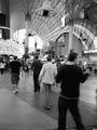
In Transitby jaysonmcComment by colorcarnival: What happens in Vegas, stays in Vegas hehe
Blur is not really something I prefer but it does help enhance the sense of motion in your pic. Good composition - there's a lot of elements to see but they don't make the pic look too busy. |
| Photographer found comment helpful. |
| 06/20/2007 07:17:43 PM |
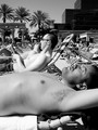
Soakingby jaysonmcComment by JerseyGenie: I think the guy in front made a great focus of this shot. I can almost count the beard stubble on his chinny chin chin. I thought this was very well done and should have scored higher. |
| Photographer found comment helpful. |
| 06/20/2007 02:04:20 PM |
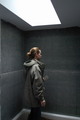
Boxed in Grayby jaysonmcComment by karmat: I think cropping the bright light out of the shot would make it feel more boxed in. Also, this seems to be more of a side shot than a backside. |
| Photographer found comment helpful. |
| 06/20/2007 11:29:39 AM |
|
| Photographer found comment helpful. |
| 06/18/2007 12:03:48 PM |
Soakingby jaysonmcComment by Melethia: I quite like the pasty white guy, and really like the fact it's a sunbathing shot without babes. :-) Great compositional elements, too, from the descending line of palms to the ascending building lines. |
| Photographer found comment helpful. |
| 06/17/2007 11:53:51 PM |
|
| Photographer found comment helpful. |
| 06/17/2007 08:13:03 PM |
Soakingby jaysonmcComment by karmat: having the guy in the foreground makes it feel like he should be the subject of the shot, but having the top of his head cropped out makes it feel incomplete. |
| Photographer found comment helpful. |
| 06/16/2007 01:16:23 AM |
In Transitby jaysonmcComment by kandykarml: lot's of noise on the image.. Maybe just a little too much motion blur from the passer by's.. Freemont st has gorgeous colors & wonder why you changed to b & w..(just curious).. I like the concept though for the challenge.. It's a 6 for me. |
| Photographer found comment helpful. |
Home -
Challenges -
Community -
League -
Photos -
Cameras -
Lenses -
Learn -
Help -
Terms of Use -
Privacy -
Top ^
DPChallenge, and website content and design, Copyright © 2001-2026 Challenging Technologies, LLC.
All digital photo copyrights belong to the photographers and may not be used without permission.
Current Server Time: 06/23/2026 11:26:12 AM EDT.