| Image |
Comment |
| 09/04/2003 08:26:43 AM |
|
 Photographer found comment helpful. Photographer found comment helpful. |
| 09/03/2003 07:52:37 PM |
Creamedby OneSweetSinComment by vonautsch: A pie tin on the head would have added to this photo. I think a black backdrop would have created more impact. |
| Photographer found comment helpful. |
| 09/03/2003 01:19:38 PM |
|
| Photographer found comment helpful. |
| 09/03/2003 12:48:12 PM |
|
| Photographer found comment helpful. |
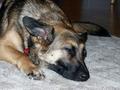
| 09/03/2003 12:18:42 PM |
Wake me at 3:15by OneSweetSinComment by e301: Seems like every other photo I get to critique is yours, Anna. Here we go again.
The framing of this seems very arbitrary - face dead centre, cut off of the elbow on the fromt leg, it doesn't feel level, but not so tilted that it would be deliberate. The colours and tones of the fur are excellently brought out, but the flash has really flattened out any texture to it, and also left the lighting of the whole thing very uneven - that area of floor top right seems almost black - a sure sign that the flash has washed out any sign of the ambient light. It's also picked up those highlights in the carpet and is making it seem particularly plastic.
The link to the challenge is clear enough for me, though I suspect not for others - that's the usual problem with scores below 4.
Why not get a tripod, and switch the flash off on your camera? I promise you you'll get better results :-)
Ed |
| 09/03/2003 07:38:27 AM |
Wake me at 3:15by OneSweetSinComment by magnetic9999: aww cute doggie... visual communication (i.e. communicating a message with a visual image) is a skill that can be learned. think about the message you want to communicate and then what actions or symbols represent that message most clearly :) .. |
| 09/03/2003 12:57:40 AM |
Wake me at 3:15by OneSweetSinComment by Sonifo: This was the most confusing picture. I really didn't get it until I read your comment. Now I get it. We had a dog that did the same thing as I was growing up. She would meet us at the bus stop. The only critique would be to get the whole dog in the shot. Keep shooting. |
| Photographer found comment helpful. |
| 09/03/2003 12:16:36 AM |
Creamedby OneSweetSinComment by K-Rob: You can't hide, OneSweetSin. We all know it's you! Well....at least I hope it is now otherwise I'll be pretty embarrased. =) |
| Photographer found comment helpful. |
| 09/02/2003 11:43:57 PM |
|
| 09/02/2003 04:25:22 AM |
Served and Fallenby OneSweetSinComment by e301: This is getting ridiculous - I only ever get your photos for the Critique Club Anna.
This is such a very literal shot, so very straight-on, and I think it's suffered for that. Sure, it gives a sense f place to the monument, but the windows and the brickwork of the building behind really draw the eye away, and make it difficult to discern any detail in the statue.
As with Pisaman's comment, I feel that you might have sacrificed too much to keep the flags in shot: and what also annoys me is that the figures in the statue look so intersting that I want ot see more detail there. I wonder if you tried a shot looking up at the figures, with the flags in the background?
I think it may be a touch over-exposed too - the highlight area, and there are a lot of them at that time of day, seem too white, blown out to me. There is also some barrel distortion around the edges - the linews of the building, and of the outer flagpoles are curved, presumably due to shooting at the widest angle: try using a touch of the zoom to correct that.
All the best
Ed |
Home -
Challenges -
Community -
League -
Photos -
Cameras -
Lenses -
Learn -
Help -
Terms of Use -
Privacy -
Top ^
DPChallenge, and website content and design, Copyright © 2001-2026 Challenging Technologies, LLC.
All digital photo copyrights belong to the photographers and may not be used without permission.
Current Server Time: 06/03/2026 02:16:33 PM EDT.