| Image |
Comment |
| 09/10/2003 08:09:23 PM |
|
 Photographer found comment helpful. Photographer found comment helpful. |
| 09/10/2003 10:59:49 AM |
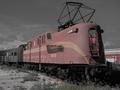
Next Stop 1952by OneSweetSinComment by justine: Not sure why the color adjustment Looks a little bit too washed out for me. The train is good and interesting to see. Your 100% on topic for the challenge. Nice going. |
| 09/10/2003 10:11:28 AM |
Next Stop 1952by OneSweetSinComment by readme: This is beautiful. If you'd cropped it a bit tighter at the top it might make it look as though it's still running! I love the neutral background that shows just enough detail. |
| Photographer found comment helpful. |
| 09/10/2003 09:15:06 AM |
|
| Photographer found comment helpful. |
| 09/10/2003 01:28:32 AM |
|
| Photographer found comment helpful. |
| 09/09/2003 11:37:17 PM |
Creamedby OneSweetSinComment by xhoss: oh man i can think of so much right now...but I'll just bite my lip! The shot looks a little grainy is my only thought. Add some additional lighting for the top of the frame maybe? |
| 09/09/2003 10:33:28 PM |
|
| 09/09/2003 08:02:05 PM |
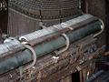
Play Me A Tuneby OneSweetSinComment by inspzil: Greetings from one of your own
By Bob
Composition - There are many good repetition photo candidates in this photo. I think choosing one aspect of the piano and not the whole thing would've been a more fruitful venture. The angle of this photo reminds me of a catalog shot, which isn't bad if you were selling it. This has the makings of some very good perspective type shots, like pseudo-abstracts or something along those lines. Even not so abstract with photos taken along its length. This 3/4 angle perspective has really flattened this subject. The lighting isn't helping that either.
Technical - Speaking of lighting, I think that being a little less liberal with the exposure and shortening the shutter would've provided a little richer tones. The overall colors of this aren't bad by any means. I think darkening the photo a bit would definitely make them a little warmer. Dropping the ISO down to 100 or lower (if possible) would've also helped the color saturation. At that shutter speed and Aperture, you definitely had room to do that without too much fear of camera shake unless you are recovering from a nasty heroin addiction or something :) My camera has a low end ISO of 64. I shoot about 0.01% of my pictures in an ISO above 64. It provides much better colors and there isn't much movement to speak of in this photo where a higher ISO would be recommended.
Overall - Not a bad subject, but a pretty bland shot. This subject has a lot of potential, but not from this angle nor this bright. I think you could've chosen one of the many repeating parts from this piano in lieu of the whole thing. It would've made for a more interesting shot. There's nothing really "wrong" with it, just not particularly appealing to the masses. 'nuff said. Good luck! - Bob |
| 09/09/2003 07:59:27 AM |
|
| 09/08/2003 11:03:36 PM |
|
| Photographer found comment helpful. |
Home -
Challenges -
Community -
League -
Photos -
Cameras -
Lenses -
Learn -
Help -
Terms of Use -
Privacy -
Top ^
DPChallenge, and website content and design, Copyright © 2001-2026 Challenging Technologies, LLC.
All digital photo copyrights belong to the photographers and may not be used without permission.
Current Server Time: 06/03/2026 02:16:32 PM EDT.