| Image |
Comment |
| 11/11/2003 09:07:09 PM |
|
| 11/11/2003 06:25:01 PM |
|
 Photographer found comment helpful. Photographer found comment helpful. |
| 11/11/2003 06:06:33 PM |
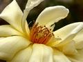
The Congregationby OneSweetSinComment by adine: I like the dark background for these soft white petals, nice composition with the cluster of anthers in the center. Feels incomplete to me - perhaps you could have included that top petal that goes out ot hte frame and cropped a bit more left and bottom - actually that could bring the "congregation" on the the magic thirds line... |
| Photographer found comment helpful. |
| 11/11/2003 01:37:38 PM |
The Congregationby OneSweetSinComment by dertyklobb: It's a great picture. You probably did everything correctly. I just don't like the flower you picked. That doesn't necessarily mean find another flower. You can sway your viewer's feelings, no matter what your subject, by controling your design elements, your photography. Zooming in closer, eliminating any background, would have made this photo better. Be bold! |
| 11/11/2003 07:56:12 AM |
|
| Photographer found comment helpful. |
| 11/11/2003 07:43:13 AM |
|
| 11/10/2003 10:53:41 PM |
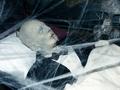
Portrait of the Deadby OneSweetSinComment by HBunch: *Critique Club*
This definately fits the theme. Creepy, Halloween style kind of feel. The shot looks good. The angle and framing/cropping are good. I like how you have placed his head in a corner and the rest falls in a diagonal. The batty thing looks a little out of place, but still fits in with the theme of scary.
Focus and clarity are good. Don't really see a DOF, but having the whole thing in focus is not a bad thing. Especially with this case. I think that the only real complaint from me would be the lighting. Looks like conditions were not ideal for the shot. The brights are maybe a little bright for the "dark spooky" theme, and there is a harsh shadow from one of the strands of cob web near the bottom right. Kind of looks like the conditions were beyond your control, but you tried to make the best of it.
Really didn't do bad, but definately could have been better.
Overall, a nice shot for the challenge.
~Heather~ |
| Photographer found comment helpful. |
| 11/10/2003 08:14:16 PM |
Call To Worshipby OneSweetSinComment by adine: A very bold blue sky, sunlight create nice shadows. The bell is a little lost in all the brightness. What about desaturating the blue and upping the green? |
| Photographer found comment helpful. |
| 11/10/2003 06:28:09 PM |
|
| Photographer found comment helpful. |
| 11/10/2003 02:22:32 AM |
|
| Photographer found comment helpful. |
Home -
Challenges -
Community -
League -
Photos -
Cameras -
Lenses -
Learn -
Help -
Terms of Use -
Privacy -
Top ^
DPChallenge, and website content and design, Copyright © 2001-2026 Challenging Technologies, LLC.
All digital photo copyrights belong to the photographers and may not be used without permission.
Current Server Time: 06/03/2026 04:46:30 PM EDT.