DPChallenge: A Digital Photography Contest You are not logged in. (log in or register
 
Browse Settings
Currently viewing:
Registered UserOneSweetSin

Show comments:

Per page:

Order:

Comments:


Comments Received by OneSweetSin
Pages:   ... [117] [118] [119] [120] [121] [122] [123] ... [161]
Showing 1191 - 1200 of ~1608
Image Comment
Trapped
06/18/2003 08:48:59 PM
Trapped
by OneSweetSin

Comment by joshua:
looks you sold yo ass to the devil!
Trapped
06/18/2003 01:56:21 PM
Trapped
by OneSweetSin

Comment by sylk:
Love the color, the flash feel ... and the expression. Nice!
Photographer found comment helpful.
Trapped
06/18/2003 11:13:38 AM
Trapped
by OneSweetSin

Comment by Dallas_TX:
Very sexy image. Well done....
Photographer found comment helpful.
Trapped
06/18/2003 11:12:08 AM
Trapped
by OneSweetSin

Comment by diegohs:
you should try it in b/w.... its gives more drama
Photographer found comment helpful.
Trapped
06/18/2003 10:52:05 AM
Trapped
by OneSweetSin

Comment by alanfreed:
Looks like one wet, sweet sin :) Nice shot!
Photographer found comment helpful.
Guidepost
06/17/2003 09:00:22 PM
Guidepost
by OneSweetSin

Comment by dsidwell:
This certainly seems appropriate for this magazine. I appreciate how the sun is just a bit off center and the whole seems interesting, despite being merely clouds and the sun.
Photographer found comment helpful.
Delicate Pink
06/16/2003 01:07:30 PM
Delicate Pink
by OneSweetSin

Comment by alanfreed:
Nice shot, good use of DOF. Not a lot of "wow" here, in all honesty, but a well-done shot.
Photographer found comment helpful.
Our Product...DelGrosso's  Amusement Park
06/14/2003 06:44:19 AM
Our Product...DelGrosso's Amusement Park
by OneSweetSin

Comment by Annida:
I wish I had that job! It looks so fun. I like the balloons on the roundabout, it looks very entertaining :)
Photographer found comment helpful.
Guidepost
06/14/2003 05:55:43 AM
Guidepost
by OneSweetSin

Comment by LarsPaysen:
Nice flare - simple shot, good for a cover. 8
Photographer found comment helpful.
Coke  Classic....aaahhhhh
06/13/2003 06:43:17 PM
Coke Classic....aaahhhhh
by OneSweetSin

Comment by karmat:
CRITIQUE CLUB CRITIQUE
by karmat

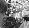
I like the general framing/cropping/composition of this shot. It leaves no question as to what the point of reference/focus is. Having said that, I do find my self looking more at the face than the bottle, so I am thinking a bit more of the face being visible may not be a bad thing. Also, this is a great use of a shallow depth of field. It really helps the background to be in the background, and not distracting at all.

A couple of minor things would have really helped it for me, though I know it may sound nit-picky. One, the side of the bottle looks like it has been pushed in, and this is causing a "crease" near the "la" toward the top. Nothing major, but if you are going to go to the trouble of framing such a nice shot, the minor details are worth it too. Also, the hands look like the are posing for a picture or something. Would it have been possible to have a more natural grip, one without looking like the bottle was resting on the fingertips?

Finally, I really do think this shot would be better in color, even though I really like black and white. The red of the label would really stand out against what I think is a green background. Being in bw it just sorta sets there, maybe.

Best to you in future challenges.
karmat
Photographer found comment helpful.
Pages:   ... [117] [118] [119] [120] [121] [122] [123] ... [161]
Showing 1191 - 1200 of ~1608


Home - Challenges - Community - League - Photos - Cameras - Lenses - Learn - Help - Terms of Use - Privacy - Top ^
DPChallenge, and website content and design, Copyright © 2001-2025 Challenging Technologies, LLC.
All digital photo copyrights belong to the photographers and may not be used without permission.
Current Server Time: 08/07/2025 07:38:45 PM EDT.