| Image |
Comment |
| 03/18/2007 10:46:14 AM |
|
 Photographer found comment helpful. Photographer found comment helpful. |
| 03/16/2007 12:56:20 AM |
|
| Photographer found comment helpful. |
| 03/15/2007 02:35:33 PM |
|
| Photographer found comment helpful. |
| 03/15/2007 12:50:17 AM |
|
| Photographer found comment helpful. |
| 03/14/2007 01:30:40 PM |
|
| Photographer found comment helpful. |
| 03/13/2007 09:19:28 AM |
|
| Photographer found comment helpful. |
| 03/12/2007 01:43:34 PM |
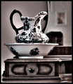
Secretby ltlmschrisssComment by asimchoudhri: this is one of the coolest shots i've seen in a while. gives a sense of mystery as to what's going on inside. too bad we can't peer through key holes any more... |
| Photographer found comment helpful. |
| 03/12/2007 04:33:00 AM |
Vanityby ltlmschrisssComment by Melethia: Very lovely, both the porcelain and the vanity. I like the reflected picture on the wall, too - increases the sense of nostalgia here. |
| Photographer found comment helpful. |
| 03/12/2007 03:34:40 AM |
Secretby ltlmschrisssComment by redmoon: an elegantly stylish image; especially like the use of the desaturation which i find to be very effective. has something very cover of a book thing about it - would probably be a fairly successful stock photo. only slight reservation is that it feels a tad too tightly cropped, and might have in fact benefitted from a black frame. and also not sure if it really says "circle" prominently enough. Otherwise very likeable though.
My New Scoring System ™; composition + technical 2/3, challenge 0.5/1, post processing results 2/2, ooooh factor 2.5/3, originality 0.5/1 = 7.5 (or 8) |
| Photographer found comment helpful. |
| 03/11/2007 10:36:05 AM |
|
| Photographer found comment helpful. |
Home -
Challenges -
Community -
League -
Photos -
Cameras -
Lenses -
Learn -
Help -
Terms of Use -
Privacy -
Top ^
DPChallenge, and website content and design, Copyright © 2001-2026 Challenging Technologies, LLC.
All digital photo copyrights belong to the photographers and may not be used without permission.
Current Server Time: 07/21/2026 07:39:25 PM EDT.