| Image |
Comment |
| 10/14/2009 06:12:04 AM |
|
 Photographer found comment helpful. Photographer found comment helpful. |
| 10/13/2009 01:45:12 PM |
|
| Photographer found comment helpful. |
| 10/13/2009 07:35:08 AM |
|
| Photographer found comment helpful. |
| 10/12/2009 11:17:58 PM |
|
| Photographer found comment helpful. |
| 10/12/2009 06:38:10 PM |
|
| Photographer found comment helpful. |
| 10/12/2009 12:55:18 PM |
|
| Photographer found comment helpful. |
| 10/12/2009 12:48:21 AM |
|
| Photographer found comment helpful. |
| 10/09/2009 11:42:40 PM |
vertigoby krnodilComment by posthumous: I bumped this all the way to 10 but didn't get back to finish my bumping and pick ribbons. Cool image. |
| Photographer found comment helpful. |
| 10/09/2009 02:06:31 AM |
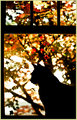
vertigoby krnodilComment by vlado: Commenting as part of my Team Suck duties...
I had a soft spot for this shot given it shared it's title with that of my first, and only (so far) ribbon photo. It is a beautiful image, but I feel Free Studies are all that kind on abstracts such as this... harsh, but true. As I look at this, trying to find the words for my comment, I feel I was too hard on this... I only gave it a 5 in voting, but as I sit and stare at it, I quite like the simply complexity of it.. sounds odd, but I don't know how else to describe it. Anyway...
How could have you scored better? I don't know that you could have, not at DPC in a FS... this is too different for this crowd. What would I have changed? Nothing really... it's great as it is, it's just under appreciated... even by me when I voted. To answer my own question I asked earlier then, I guess it might have done better if EVERYONE had to sit and contemplate the image to write a half decent comment... unfortunately, I can't see that becoming a requirement at DPC.
So... in conclusion, a beautiful image... just to complex to the average DPC voter to appreciate in the 5-15 seconds most give each photo when voting. Well done... |
| Photographer found comment helpful. |
| 10/08/2009 07:32:46 PM |
vertigoby krnodilComment by bvy: 4.6?! I just don't get it. Well, maybe I do. This shot reminded me of my Negative Space entry from last year some time. I like yours better; the defocus keeps the eye on the fractal pattern, which is what you're trying to show off. Not for everyone, I guess. I gave it an eight. Great shot! |
| Photographer found comment helpful. |
Home -
Challenges -
Community -
League -
Photos -
Cameras -
Lenses -
Learn -
Help -
Terms of Use -
Privacy -
Top ^
DPChallenge, and website content and design, Copyright © 2001-2026 Challenging Technologies, LLC.
All digital photo copyrights belong to the photographers and may not be used without permission.
Current Server Time: 07/24/2026 07:20:21 PM EDT.