|
|
|
Showing 161 - 170 of ~205 |
| Image |
Comment |
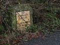
| 01/25/2003 02:32:20 PM | Vintageby auroraComment by DougPaz: Nice shot, I wish it was just a bit brighter though. I'm glad you didn't move the brush away from the front, that really makes it. |
| 01/24/2003 06:14:34 PM | Vintageby auroraComment by Silver Fox: Really nice piece of history. Love the color, and you show the moss on the rock really nice along with the dead colored leaves, black pavement, etc. |
| 01/24/2003 12:35:00 AM | |
| 01/23/2003 12:25:01 AM | Vintageby auroraComment by PTLParsons: How slow one must drive to read this sign. It really should be cleaned up and the weeks cut back from around it. I'm serious. This is an antique and should be preserved, other than just in a really good photo, which you have done for an 8 |
| 01/22/2003 11:14:54 PM | |
| 01/22/2003 01:58:03 PM | Vintageby auroraComment by joshua: cool sign. the overgrowth helps present the feeling of age in the picture. nice clarity also |
| 01/22/2003 10:49:12 AM | Vintageby auroraComment by kathleenm: This is great. I love the greens and the lichen on the rock, I'm glad you went with color rather than black and white. 8 |  Photographer found comment helpful. Photographer found comment helpful. |
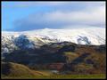
| 01/21/2003 10:07:18 PM | Seasonsby auroraComment by RiderGal: Critique Club
This is an awesome photo! I love the contrasts between the green at the bottom and the snowy mountains at the top. Those mountains must go to some pretty high altitudes! :-) My favorite thing about this photo, is the sense that you can stay on the photo, and just circle around looking at it, and the closure that the clouds at the top give it. Your exposure here is excellent, you were able to catch the details both in the dark and the light parts of the photo which can be quite tough. Also the blue sky really adds some color to the overall photo, which is nice. Your focus here is perfect, and I like your use of DOF, allowing for everything to be in focus... which is very important for this particular photo. The fact that it looks like you went just at the right time of day is a big part of what makes this photo so nice, the light at that time was simply perfect for what you wanted. Although I'm not usually a big border fan, I like your use of borders here, the single pixel greenish border really adds to the photo, then encircled by the black border it finishes it off. I like your composition here, the whole photo seems to lead you to the upper right hand corner, and I like your layering as well...The one thing that bothers me is maybe how it looks just slightly tilted, but it's very hard with things that aren't straight. Overall you have one beautiful photo here! I hope you enjoyed that lovely walk in the Lake District as much as I've enjoyed looking at and analyzing your photo. GREAT job! | | Photographer found comment helpful. |
| 01/21/2003 09:04:46 PM | Vintageby auroraComment by dodobird: Very neat road sign find. It is a bit hard to read, but that just adds to the feel of the age. The focus is excellent on the very very sharp on the sign :). I keep debating whether I like the road in the shot or not. It adds to our understanding that it is a road sign, which without some would probably question, but if it wasn't for this fact I would have left the road out. Overall though, I like the change from all the traditional road signs. 7. |
| 01/21/2003 11:51:46 AM | Vintageby auroraComment by mjcecil: Pretty good. I would probably have backed up, zoomed in and opened the lens up to get a narrow DOF to isolate the roadmarker from the confusion of its environment. |
|
Showing 161 - 170 of ~205 |
Home -
Challenges -
Community -
League -
Photos -
Cameras -
Lenses -
Learn -
Help -
Terms of Use -
Privacy -
Top ^
DPChallenge, and website content and design, Copyright © 2001-2026 Challenging Technologies, LLC.
All digital photo copyrights belong to the photographers and may not be used without permission.
Current Server Time: 04/02/2026 03:50:24 AM EDT.
|