| Image |
Comment |
| 02/18/2004 11:29:52 AM |
|
 Photographer found comment helpful. Photographer found comment helpful. |
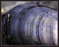
| 02/18/2004 10:51:44 AM |
Sunlight on a Leafby MonaComment by jpochard: I wish the leaf had been more prominent. I see the texture and the lighting is good. Just not a subject that appeals to me, though. |
| Photographer found comment helpful. |
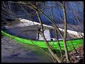
| 02/17/2004 11:40:44 PM |
Water Or ?by MonaComment by justine: Love the green against the blue. Too bad the tree was there!! Good luck in the challenge. |
| Photographer found comment helpful. |
| 02/17/2004 11:08:24 PM |
Water Or ?by MonaComment by sfalice: I very much like this colorful rendition of the Challenge. The bright green boat is perfectly composed in the image and interacts well with the blue of the water. Well done. 8 |
| Photographer found comment helpful. |
| 02/17/2004 07:13:43 PM |
|
| Photographer found comment helpful. |
| 02/17/2004 04:12:50 PM |
|
| Photographer found comment helpful. |
| 02/17/2004 08:08:07 AM |
Letting Go In Your Own Wayby MonaComment by RedHotKK: The brightness of the sky in this one bothers my eyes...I think if that was toned down a little it might be a better photograph. Other than that it is a nice shot. |
| Photographer found comment helpful. |
| 02/17/2004 07:00:43 AM |
|
| Photographer found comment helpful. |
| 02/16/2004 07:41:45 PM |
|
| Photographer found comment helpful. |
| 02/16/2004 05:01:16 PM |
|
| Photographer found comment helpful. |
Home -
Challenges -
Community -
League -
Photos -
Cameras -
Lenses -
Learn -
Help -
Terms of Use -
Privacy -
Top ^
DPChallenge, and website content and design, Copyright © 2001-2026 Challenging Technologies, LLC.
All digital photo copyrights belong to the photographers and may not be used without permission.
Current Server Time: 06/04/2026 05:17:00 AM EDT.