| Image |
Comment |
| 09/03/2008 06:03:52 AM |
|
 Photographer found comment helpful. Photographer found comment helpful. |
| 09/03/2008 03:54:08 AM |
Nightmareby levyj413Comment by HarryY: This is creepy, but I like it!
Bit strange how the nose is floating all by itself...
6 |
| Photographer found comment helpful. |
| 09/03/2008 01:34:30 AM |
|
| Photographer found comment helpful. |
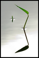
| 09/02/2008 08:59:45 PM |
Serenityby levyj413Comment by Alain: I like this kind of picture... very strong entry IMO, very well done :) |
| Photographer found comment helpful. |
| 09/02/2008 08:53:12 PM |
Serenityby levyj413Comment by photokariangel: reminds me of something IreneM would do. if your not her, then that is a huge compliment. the serenity is amazing, and i love the little drops of water, great work. |
| Photographer found comment helpful. |
| 09/02/2008 04:02:48 PM |
|
| Photographer found comment helpful. |
| 09/02/2008 03:47:35 PM |
|
| Photographer found comment helpful. |
| 09/02/2008 12:57:41 PM |
|
| Photographer found comment helpful. |
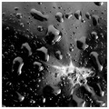
| 09/02/2008 12:06:42 PM |
Continuum Riftby levyj413Comment by K3Master: My hatred for water-drops takes a back seat to the gorgeous use of the splatter. However, without the water-drops, I'd have been inclined to bump you up 2 or more points. |
| Photographer found comment helpful. |
| 09/02/2008 10:57:37 AM |
Continuum Riftby levyj413Comment by escapetooz: kind of looks like a galaxy! I'm guessing by the title that's what you were going for. very cool and nice composition. |
| Photographer found comment helpful. |
Home -
Challenges -
Community -
League -
Photos -
Cameras -
Lenses -
Learn -
Help -
Terms of Use -
Privacy -
Top ^
DPChallenge, and website content and design, Copyright © 2001-2026 Challenging Technologies, LLC.
All digital photo copyrights belong to the photographers and may not be used without permission.
Current Server Time: 06/14/2026 06:53:09 PM EDT.