| Image |
Comment |
| 10/04/2007 11:41:41 AM |
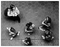
Overheadby levyj413Comment by Abstract: a very good out-of-the-box thinking. immediately noticed the 5-ring-olympic symbol pattern with lower five girls. 9 |
 Photographer found comment helpful. Photographer found comment helpful. |
| 10/04/2007 10:37:22 AM |
Overheadby levyj413Comment by Yo_Spiff: I like the tiles and the image guides me toward the adult as the primary subject. |
| Photographer found comment helpful. |
| 10/03/2007 11:32:22 PM |
Intensityby levyj413Comment by Tammer: A little too washed out for my personal tastes, though I do like the angle and off-centered composition. |
| Photographer found comment helpful. |
| 10/03/2007 06:58:15 AM |
Overheadby levyj413Comment by Melethia: Very nice editing here - and I guess she does look better dodged - I'll have to compare with your other shot. Hopefully this is doing well - I really like this for the challenge alot! Yep, looks better (just compared). What did you do to reduce the whites so much? |
| Photographer found comment helpful. |
| 10/02/2007 12:59:33 PM |
Intensityby levyj413Comment by HeiSch: very creative picture. I like your high key approach.combined with motion blur. The result is very pleasing and pulls the viewer right into you picure. Well done |
| Photographer found comment helpful. |
| 10/02/2007 09:23:30 AM |
Intensityby levyj413Comment by noraneko: Jeffrey - I appreciate the risk you took entering this photo, and the fact that both Neil and Deb really like it says a lot. This one does not work for me overall - I'm not a fan of the colors, and I think the lines leading away from the turquoise/greenish design on her shirt pull the eyes right out of the photo. I do like her facial expression and the sense of motion apart from the aforementioned turquoise lines. In the end I think it's very cool that you entered this instead of a "safe" photo. You probably knew you'd get hammered, but hopefully you'll get some interesting comments - and you already have one fave, right? |
| Photographer found comment helpful. |
| 10/02/2007 07:29:31 AM |
|
| Photographer found comment helpful. |
| 10/02/2007 01:37:10 AM |
Intensityby levyj413Comment by JeffDay: This is very interesting, really enjoy it. I hope people have their monitors calibrated, I think some will be lost if not. Can't quite figure out the processing, not just simple blur, seems to have some texture. Would be interested in how you did this. Only (small) gripe would be the expression, to me this seems playful, but the expression deosn't match. |
| Photographer found comment helpful. |
| 10/01/2007 11:39:09 PM |
Intensityby levyj413Comment by EyeTrap: Low vote, the motion adds nothing and the subject almost looks angry that you are taking her photo with her head tilted down. Too white washed and the only thing that really stands out is the hair. (footnote: yes i did read picture title but its not conveyed imo) |
| Photographer found comment helpful. |
| 10/01/2007 10:02:01 PM |
Intensityby levyj413Comment by klstover: Maybe would have prefered the main figure to be a bit darker to contrast more with the background. She looks like she's walking out of a dream world, and has seen something very sobering that she wants to tell you with her gaze. Very neat. |
| Photographer found comment helpful. |
Home -
Challenges -
Community -
League -
Photos -
Cameras -
Lenses -
Learn -
Help -
Terms of Use -
Privacy -
Top ^
DPChallenge, and website content and design, Copyright © 2001-2026 Challenging Technologies, LLC.
All digital photo copyrights belong to the photographers and may not be used without permission.
Current Server Time: 06/23/2026 02:56:10 AM EDT.