| Image |
Comment |
| 11/08/2006 11:43:59 AM |
|
 Photographer found comment helpful. Photographer found comment helpful. |
| 11/08/2006 09:05:45 AM |
Twinkle Twinkleby dmaddenComment by jaxed: Nice star effect and good sharpness. A crop taking out a little more than half of the right of the picture would help make the biggest light the focal point, the way it is there doesn’t seem to be a main subject. |
| Photographer found comment helpful. |
| 11/07/2006 01:56:55 PM |
|
| Photographer found comment helpful. |
| 10/30/2006 10:27:37 AM |
expressive momentby dmaddenComment by Lorenza F: The portrait is beautiful. Nice skin tones, good b/w, beautiful little girl, intense expression; personally I would have allowed a little more space below her face. The bokeh however does not seem IMHO to enhance this portrait, I find it a bit distracting; however it's 8 for me. |
| Photographer found comment helpful. |
| 10/28/2006 03:58:13 PM |
|
| Photographer found comment helpful. |
| 10/28/2006 09:59:41 AM |
expressive momentby dmaddenComment by sacredspirit: Portraiture seemed to be the going strategy for top spots this Bokeh round. With this one its not the portrait so much, which is amazing, but its the bokeh that is lacking that certain pizazz. I still have this ranked really high in the crowd, Top 10, I only wanted to mention the bokeh in a lame attempt to be helpful. LOL. GL. |
| Photographer found comment helpful. |
| 10/27/2006 09:18:44 AM |
|
| Photographer found comment helpful. |
| 10/26/2006 06:19:26 PM |
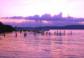
Those pastel morningsby dmaddenComment by klstover: *Critique Club*
While this is a nice shot overall, I think you could have achieved your goal of emphasizing the gulls and boats a bit better by cropping out some of the bottom. The patterns in the water are nice but they really do not add a whole lot to the main point of the photo. Personally, I would have cropped so that the horizon line was in the exact center of the shot. (However, I think this idea may not have done so well with the voters!!)
I like the contrast here. The color is nice, but it does feel a little too fake or processed to me. I would have liked to see some of the oranges brought out a little more, if possible.
The other thing I want to mention is: Your horizon is obviously straight, but the way the clouds are just gives a bit of a tilting feel to the photo. But this is a very minor point, and doesn't affect my initial impression of the shot.
I have probably sounded very critical but the main thing is that your image is very nice to look at and I am just nitpicking some things to hopefully be helpful. Congrats on a nice, peaceful, and beautiful shot. |
| Photographer found comment helpful. |
| 10/25/2006 11:40:27 PM |
|
| Photographer found comment helpful. |
| 10/25/2006 10:55:53 PM |
|
| Photographer found comment helpful. |
Home -
Challenges -
Community -
League -
Photos -
Cameras -
Lenses -
Learn -
Help -
Terms of Use -
Privacy -
Top ^
DPChallenge, and website content and design, Copyright © 2001-2026 Challenging Technologies, LLC.
All digital photo copyrights belong to the photographers and may not be used without permission.
Current Server Time: 06/23/2026 07:30:10 AM EDT.