| Image |
Comment |
| 08/31/2006 02:34:58 PM |
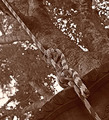
Prayer Timeby BeckyTComment by sukuriant: The stained glass window is tilted slightly, and I can see just a bit of the girl. It's a beautiful picture, though... and presents something I need to do. I like it... |
 Photographer found comment helpful. Photographer found comment helpful. |
| 08/31/2006 01:14:55 PM |
Prayer Timeby BeckyTComment by lambie83: The background is a little too dark compared to the silhouette. Needs more contrast. |
| Photographer found comment helpful. |
| 08/31/2006 09:09:21 AM |
|
| Photographer found comment helpful. |
| 08/30/2006 08:11:55 PM |
Prayer Timeby BeckyTComment by jeannybeany: I like this... the only thing, however, although the background is beautiful, the brightness of it takes away from the silhouette slightly...beautiful idea though! |
| Photographer found comment helpful. |
| 08/30/2006 12:43:19 PM |
Prayer Timeby BeckyTComment by NoellaSue: Though I know the window is supposed to add to the ambience, it seems distracting, overpowers the subject - the praying girl. |
| Photographer found comment helpful. |
| 08/30/2006 12:35:57 AM |
Prayer Timeby BeckyTComment by xXxscarletxXx: OK i get what you were trying to do here the silhouette should have more light behind it the red stainded glass is too dark >.< |
| Photographer found comment helpful. |
| 08/29/2006 09:24:14 AM |
|
| Photographer found comment helpful. |
| 08/28/2006 02:24:21 AM |
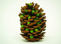
Guys, I don't think this is our pod!by BeckyTComment by wavelength: Greetings from the Critique Club. :O)
The composition here is a bit lacking. It feels a bit indecisive as to where you wanted to place the subject. Just slightly off-center, and not really to the right, yet leaning to the left. It just makes the whole thing FEEL off kilter. You don't want people to get that feeling when the look, because then they're not sure how to vote ;)
This is a very nice and clean white BG, but I'm not sure it really servers the photo all that well. Actually, I'm thinking a more complicated setup would feed better into the joke at the bottom. Maybe laying in a piney bed of underbrush or somthing. A little more complex, but still do-able indoors. Lighting here is good, I like the shiny wetness of the peas contrasted with the earthy pinecone tones.
I, personally, am not fond thepicture depending entirely upon the title. If it can't stand as a picture without the title at all, then the concept comes across weakly, deadens the impact of the idea. I'm not saying that a title can't be the icing, but they should compliment each other, not ride upon the back of the other to carry the photo.
|
| Photographer found comment helpful. |
| 08/25/2006 10:57:41 AM |
|
| Photographer found comment helpful. |
| 08/24/2006 02:33:42 PM |
|
| Photographer found comment helpful. |
Home -
Challenges -
Community -
League -
Photos -
Cameras -
Lenses -
Learn -
Help -
Terms of Use -
Privacy -
Top ^
DPChallenge, and website content and design, Copyright © 2001-2026 Challenging Technologies, LLC.
All digital photo copyrights belong to the photographers and may not be used without permission.
Current Server Time: 06/21/2026 03:58:11 AM EDT.