lifelessby
ShrinkComment by digitalknight: Greetings from the Critique Club!
This is an interesting image - black and white is one of my favorite mediums. Let's dig right in here.
Composition:
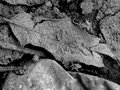
I'm guessing the leaf is the subject of this photo - so the basic composition is centered. I like the angle of the leaf being framed to give us some angles in the composition - this adds energy and gives my eye lines to move along in the image.
However the first point of interest for me is not the leaf - it's the rock under the leaf. The rock is the closest thing to white in the image, and the eye of your audience will be drawn to the highest contrast area of your image. For my eye, that is the dark shadows right next to the bright rock - then after some time my eye wanders to what you were really trying to show me.
I tell my students to figure out what it is that drew their eye to take the photo to start with, and isolate that as you start exploring your subject. If your camera can't get that close - then explore those "simplified" possibilities using your crop tool.
By simplified I mean the photo is ONLY of the thing that caught your eye. Your audience has no choice but to see what you saw in the way you saw it.
Once you have explored your simplified view of your subject, branch out and see if putting your subject on the "third" lines to add more negative space to the right or left, top or bottom adds more or detracts from what you are trying to show. Then work on showing your subjectl from an angle that the normal mere-mortal wouldn't see it from, try rotating the camera as you shoot to accentuate the angles - thoroughly exploring the possibilities of showing the world the cool visual thing you have found.
In this case, crop most of that rock right out of there!
Also, you may want to review the submitting for challenges tutorial. When images are less than the 640 pixels allowed - voters tend to punish for that. Sad but true.
Lighting:
The main thing I have to say about the lighting here is I wish there were more. Your image goes all the way to black in areas, but never quite makes it to white - so the tonal range possiblities here aren't what they could be. You pushed the contrast - then by decreasing the brightness you in essence took the contrast back out. Play with that some and see what you think.
If it were a perfect world:
At least according to me, this image would be shot from a different angle, one I'm not used to seeing a leaf from - would be 640 pixels wide, and would have a full range of blacks and whites to increase the contrast.
This is a great piece of creative work though! The leaf and the dust/dirt on it are an excellent take on the challenge. Become friends with those basic rules of composition (hundreds of tutorials on line if you google "photo composition if you need to review them) and they will serve you well.
If you have questions about this critique, feel free to contact me through the DPC PM system - I'll be glad to clarify anything that I have left unclear.
Welcome to DPC - you have a great solid score on your first outing - I'm looking forward to seeing more of your work in the coming challenges.
Regards,
Doug