| Image |
Comment |
| 09/21/2007 12:19:37 PM |
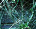
Fly Like An Eagleby EssAreDubyaComment by HeiSch: I don't belive you wanted the tree to be a major element of your picture, right? Setting a frame and showing the environment, yes. The way it is now, the tree is the main object and graws attention away from your eagle. Enforced even by the birds melting with the tree. check your sensor dust(?) :) |
 Photographer found comment helpful. Photographer found comment helpful. |
| 09/21/2007 08:56:23 AM |
Fly Like An Eagleby EssAreDubyaComment by P_Nut: Composition is not the best, also the dust on the sensor is disturbing.
Otherwise, i think this photo has great potential. |
| Photographer found comment helpful. |
| 09/20/2007 01:14:32 PM |
|
| Photographer found comment helpful. |
| 09/20/2007 04:31:24 AM |
|
| Photographer found comment helpful. |
| 09/20/2007 03:22:29 AM |
Fly Like An Eagleby EssAreDubyaComment by nutzito: basic editing rules allow cloning out those distracting sensor dust spots on the upper right. the composition does not look balanced. too bad the wing merges with the tree. |
| Photographer found comment helpful. |
| 09/19/2007 09:45:37 PM |
Fly Like An Eagleby EssAreDubyaComment by noraneko: I'm sure you've already gotten this comment, but cloning out dust spots is legal in basic :-) The silhouette of the bird is nice; will ignore the dust spots while voting as I assume this is one of your first challenges. |
| Photographer found comment helpful. |
| 09/15/2007 10:25:38 AM |
Sunscreenby EssAreDubyaComment by violinist123: Critique Club feedback -
An argument can be made that this is motivating people to use sunscreen, but a more widely accepted notion of motivational posters would likely classify this as some sort of public service or health awareness announcement. Judging from the large amount of 4's voted, I'm guessing a lot of people liked the image and voted down a bit for the message.
The shot itself is nice. Decent composition and lighting, if a little blown out on the woman's legs.
The font itself is a bit lack luster, and fails to deliver its message with impact. In these posters, how the message is presented is as important as both the image used and the message itself. It's a complete package and all three really need to be on the spot for the overall effect to work. Let's face it, these posters are pure propaganda and propaganda is an art unto itself.
Good luck!
|
| 09/09/2007 12:31:19 PM |
|
| Photographer found comment helpful. |
| 09/09/2007 03:01:30 AM |
|
| Photographer found comment helpful. |
| 09/08/2007 12:26:44 AM |
|
| Photographer found comment helpful. |
Home -
Challenges -
Community -
League -
Photos -
Cameras -
Lenses -
Learn -
Help -
Terms of Use -
Privacy -
Top ^
DPChallenge, and website content and design, Copyright © 2001-2026 Challenging Technologies, LLC.
All digital photo copyrights belong to the photographers and may not be used without permission.
Current Server Time: 05/07/2026 01:23:20 AM EDT.