| Image |
Comment |
| 10/16/2006 11:27:22 PM |
|
| 10/16/2006 03:10:46 AM |
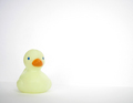
Aloneby LitlaComment by betelgeuse: nice placing.. perhaps a different coloured ducky would have added kick.. the line through the middle is showing and that seems to decrease quality.. |
| 10/16/2006 03:10:30 AM |
Aloneby LitlaComment by mihaibadic: a little sharper and a touch of extra contrast would have done the job. still nice though. |
| 10/15/2006 01:27:09 PM |
|
| 10/14/2006 05:36:10 PM |
Aloneby LitlaComment by EssAreDubya: I'd would like to see this with a stronger focus and sharper contrast. Still a decent shot. |
| 10/13/2006 04:01:06 PM |
Aloneby LitlaComment by ladyhawk22: I really like the "lighter" tones of this photo....almost pastel. To me, it's really indicative of the title "Alone." To the left of the duck, I can almost see some kind of line in the background, which stands out a bit because of the light coloring. Other than that, I like the white background with this shot. |
| 10/13/2006 12:44:43 PM |
Aloneby LitlaComment by UrfaK: The simplicity is really effective..good job! |
| 10/12/2006 05:40:17 PM |
Aloneby LitlaComment by Jaded_Housewife: there a dot on the duck that is distracting me but otherwise cute light angelic lighting. |
| 10/12/2006 02:07:05 PM |
Aloneby LitlaComment by Balko: Meets Challenge = 2
Technical Stuff = 2
Creativity = 1
Overall Impression = 2
Biased Wow Factor = 1 |
| 10/12/2006 10:33:50 AM |
|
Home -
Challenges -
Community -
League -
Photos -
Cameras -
Lenses -
Learn -
Help -
Terms of Use -
Privacy -
Top ^
DPChallenge, and website content and design, Copyright © 2001-2026 Challenging Technologies, LLC.
All digital photo copyrights belong to the photographers and may not be used without permission.
Current Server Time: 07/16/2026 02:31:42 PM EDT.