| Image |
Comment |
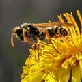
| 04/07/2003 05:00:45 AM |
Yellow by miracComment by inspzil: Great color. Nice subject and well taken. We won't be seeing any of those for awhile until the temperature gets a little warmer. |
 Photographer found comment helpful. Photographer found comment helpful. |
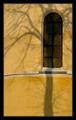
| 02/25/2003 12:50:15 PM |
Treeby miracComment by JPR: I'm back here again to let you know this was one of 4 of my tens this week and I'm very surprised to see it placed so low. I marked it as one of my favorites and I'd gladly trash half of the photos that beat you. Great job. |
| Photographer found comment helpful. |
| 02/24/2003 01:16:38 PM |
Treeby miracComment by dsidwell: Maybe some didn't feel it was yellow enough, but I still think that it is well composed. The yellow wall gives the image both structure and depth, and I love the contrasting darks with the blurry shadow and sharp window. I say yay! |
| Photographer found comment helpful. |
| 02/23/2003 10:47:13 PM |
Treeby miracComment by jmsetzler: This is quite nice :) I think the tree shadow adds quite a bit to this shot.. the snow on the windowsill is also nice... excellent work :) - setzler |
| Photographer found comment helpful. |
| 02/23/2003 10:17:17 PM |
Treeby miracComment by dsidwell: While most photos have offered yellow objects, you have given us a yellow background, which originality I applaud. I like the sharp window panes contrasting the blurrier tree shadow. This photo works for me. |
| Photographer found comment helpful. |
| 02/23/2003 02:26:32 PM |
Treeby miracComment by Kavey: Post card shot :) I like this image a lot. Door feels a little too close to top edge of frame and border is just a tad heavy for my tastes.
7, Kavey |
| Photographer found comment helpful. |
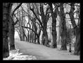
| 02/23/2003 11:24:49 AM |
Empty promenade by miracComment by sylandrix: Greetings from the Critique Club!
COMPOSITION... The photo has very strong compositional elements... The path is placed on the lower 3rd of the photo, and the eye naturally follows it from one end to the other. Trees are sometimes difficult to arrange in a pleasing manner, but here they are at even spaces away from each other, and I like how dow the road, two branches almost seem to meet and form an arch over the roadway! Nothing else clutters up the picture... As for the person, as a standalone photograph, if an element like this is too small and obscured to see, then I don't find it does much for the photograph, and can even hurt it in fact - since its something that doesn't have to be there - if an element can be removed without it seriously affecting the mood and strength of a photo, then its extraneous and shouldn't be there. But challenge-wise, without it the photo could have scored lower. I think its the nature of the contest that caused all these small elements to be in photos that didn't need them.
TECHNIQUE... Great choice of black and white.. might not have been as strong if you stuck to color. The contrast is just excellent - adding an extra punch to your image. Sharp, clear image, and neutral, effective border...
OVERALL... An excellent shot!, Congratulations on your first place win! |
| Photographer found comment helpful. |
| 02/23/2003 01:12:52 AM |
|
| Photographer found comment helpful. |
| 02/22/2003 07:23:56 PM |
Treeby miracComment by JPR: Another good one this week. The composition is excellent with the curved almost straight lines being overpowered by the shadow of the crooked tree. Lovely shot, although its not all that yellow, it doesn't matter to me! 10 |
| Photographer found comment helpful. |
| 02/21/2003 10:07:10 AM |
|
| Photographer found comment helpful. |
Home -
Challenges -
Community -
League -
Photos -
Cameras -
Lenses -
Learn -
Help -
Terms of Use -
Privacy -
Top ^
DPChallenge, and website content and design, Copyright © 2001-2026 Challenging Technologies, LLC.
All digital photo copyrights belong to the photographers and may not be used without permission.
Current Server Time: 07/15/2026 03:47:01 PM EDT.